Home > Product Work > XpuntoCero Digital Transformation
XpuntoCero Digital Transformation
Product Designer & Front-End Developer
Internal rebrand of a legacy SaaS platform.
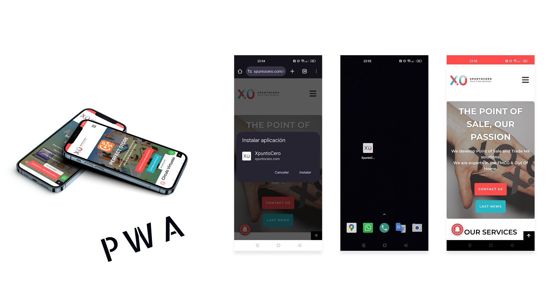
I led the UX and visual redesign and partnered with engineering to ship a fast PWA.
Results: +40% mobile traffic, +15% qualified leads, and 2× demo requests, proving how a refreshed brand and faster UX directly improved conversions.
Revitalizing a SaaS Brand for Growth
XpuntoCero, a B2B SaaS provider specializing in point-of-sale solutions for FMCG, Out-of-Home services, and Digital Marketing, had a strong product but an outdated brand. After years without a redesign, its interfaces no longer reflected the company’s innovation or technical depth.
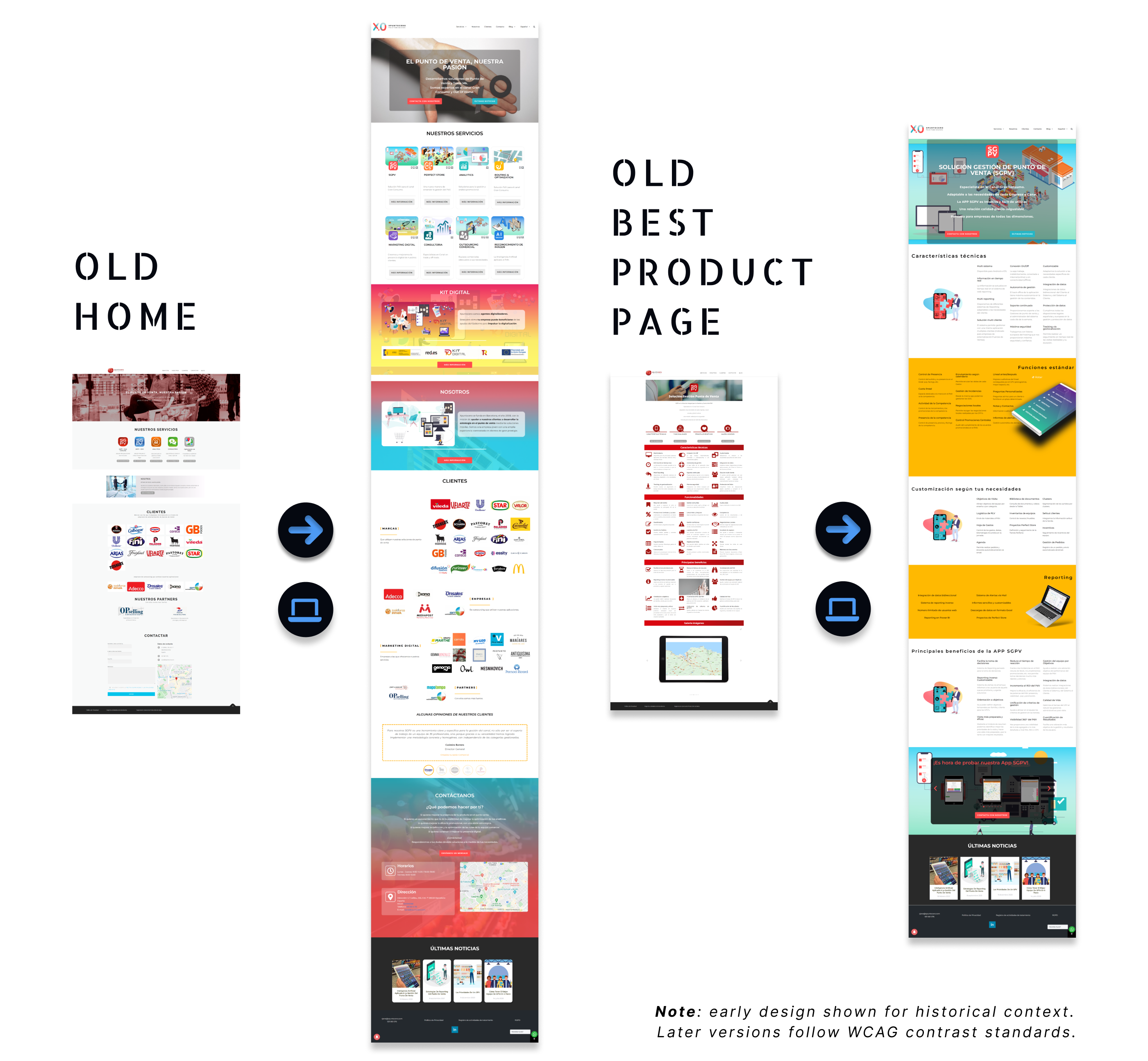
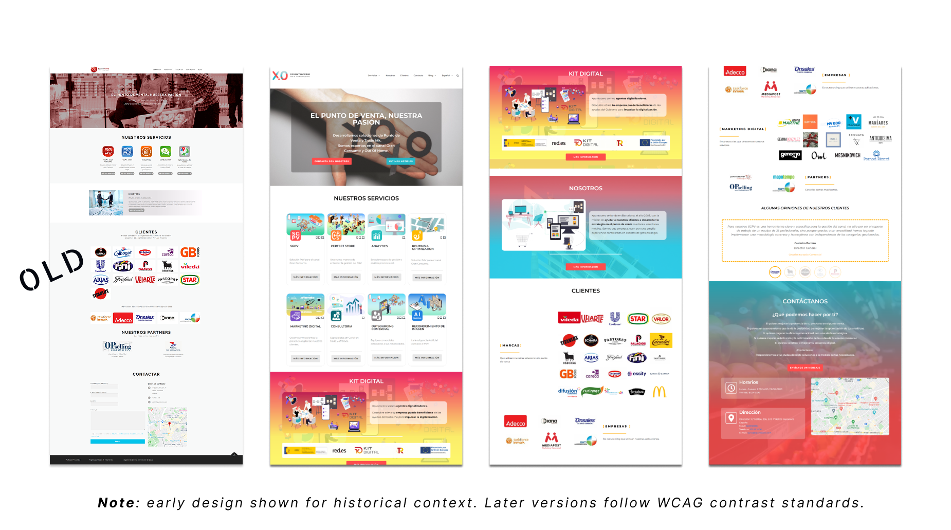
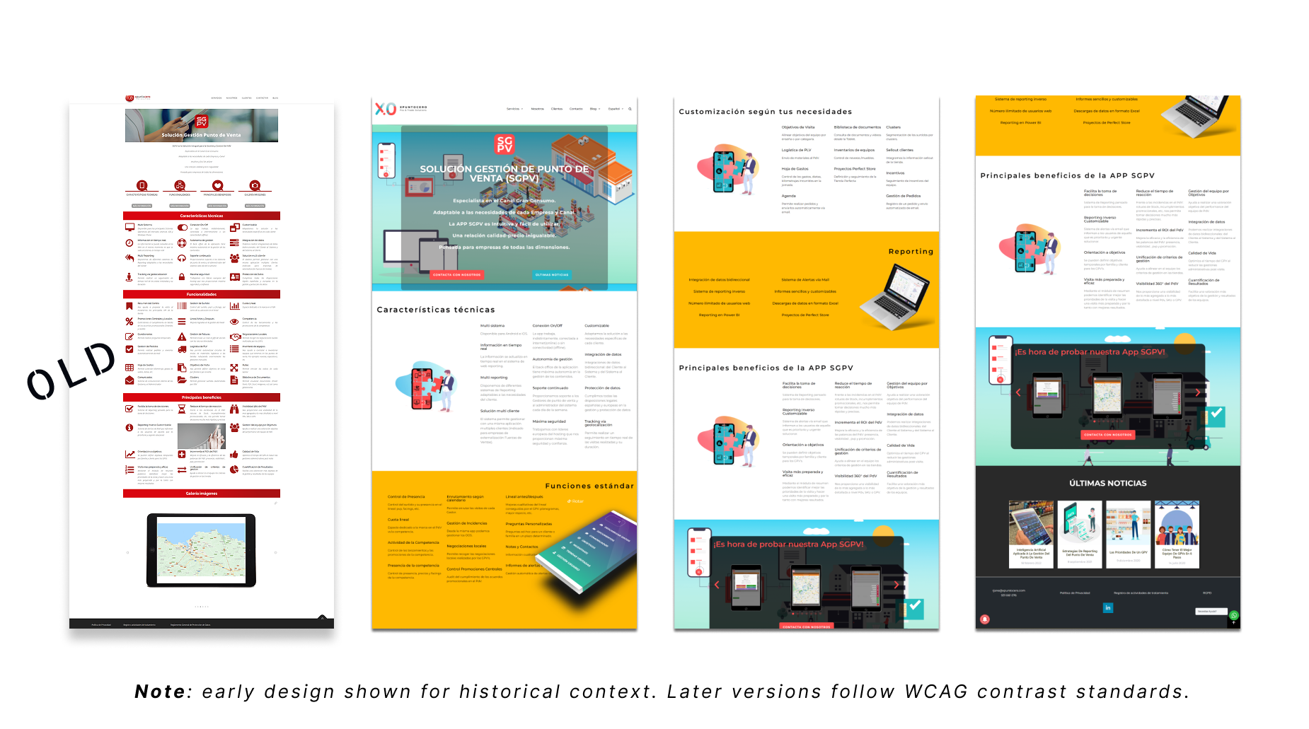
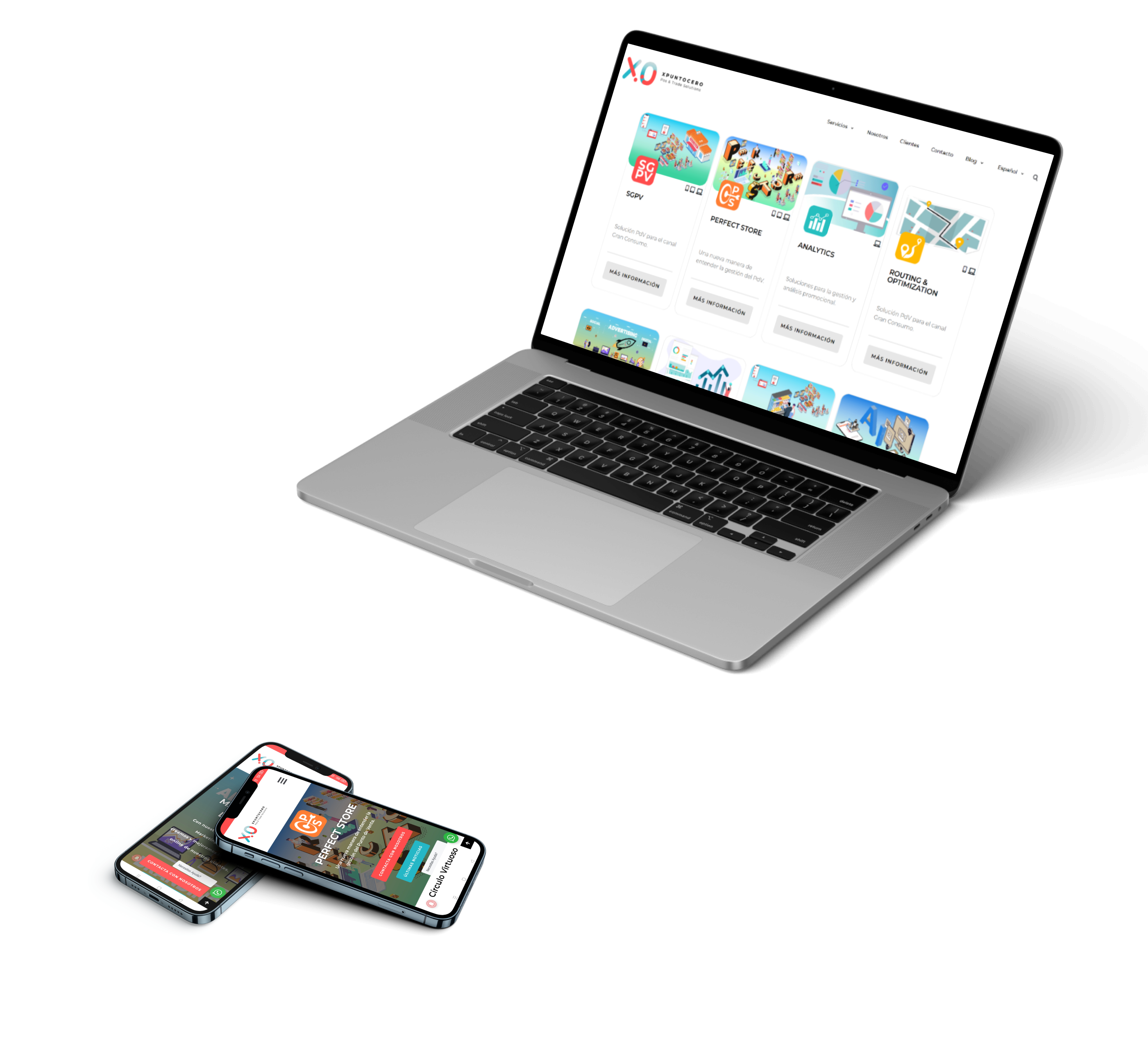
The image above shows how the new design modernized the experience, improving clarity, hierarchy, and visual consistency across key pages.
I led the UX and visual rebrand, connecting research insights with a new design language. This included refining the logo, color palette, icon system, and overall interface composition, then implementing the new front-end on a performant PWA.
The result was a cohesive brand presence that felt faster, clearer, and more credible, driving measurable results such as 2× more demo requests and stronger lead conversion.
The Challenge
The outdated design and weak mobile experience made the company appear less innovative, while inconsistent hierarchy and typography hurt clarity and user trust during sales demos.
My Role
Product Designer & Front-End Developer
- • Led UX research and brand redesign strategy
- • Defined new information architecture and visual system
- • Designed isometric illustrations and refined logo system
- • Implemented PWA front-end with WordPress integration
Scope
- • Internal product rebrand across 8 SaaS solutions
- • UX/UI modernization for web and mobile
- • Logo and visual identity refresh
- • PWA implementation and performance optimization
Project Impact
Design Evolution
Business Context
XpuntoCero is a B2B SaaS company providing point-of-sale and marketing platforms for clients in the FMCG and Out-of-Home sectors. The company also develops SGPV, a field operations app used by merchandisers from major consumer brands across Southern Europe. After more than a decade without a redesign, XpuntoCero’s visual identity no longer reflected the quality or innovation of its technology.
Over time, the brand began to feel dated. The old website was slow on mobile and visually inconsistent, making it harder to communicate the company’s value and innovation. Competing startups looked fresher and more user-friendly, which made XpuntoCero appear less dynamic than it actually was.
The company needed to refresh its brand and user experience to regain credibility, improve mobile performance, and clearly communicate the value of its multi-product ecosystem to enterprise buyers.
Research & Design Approach
Discovery
I began with a competitive and heuristic review of similar B2B SaaS platforms to identify visual and structural patterns that conveyed innovation and trust. Five quick interviews with existing clients and internal stakeholders helped uncover perception gaps and usability issues, especially on mobile.
Key Insights
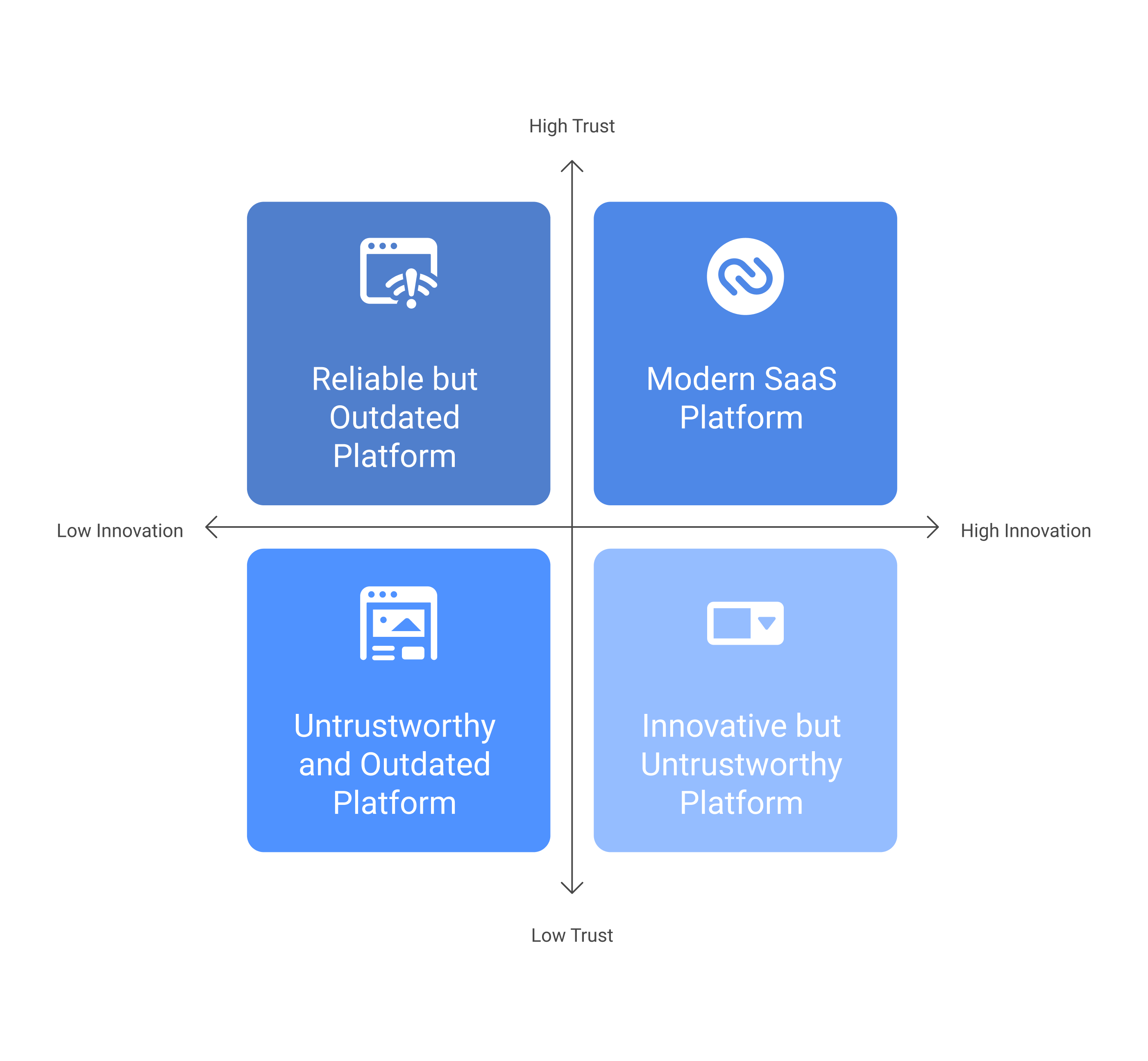
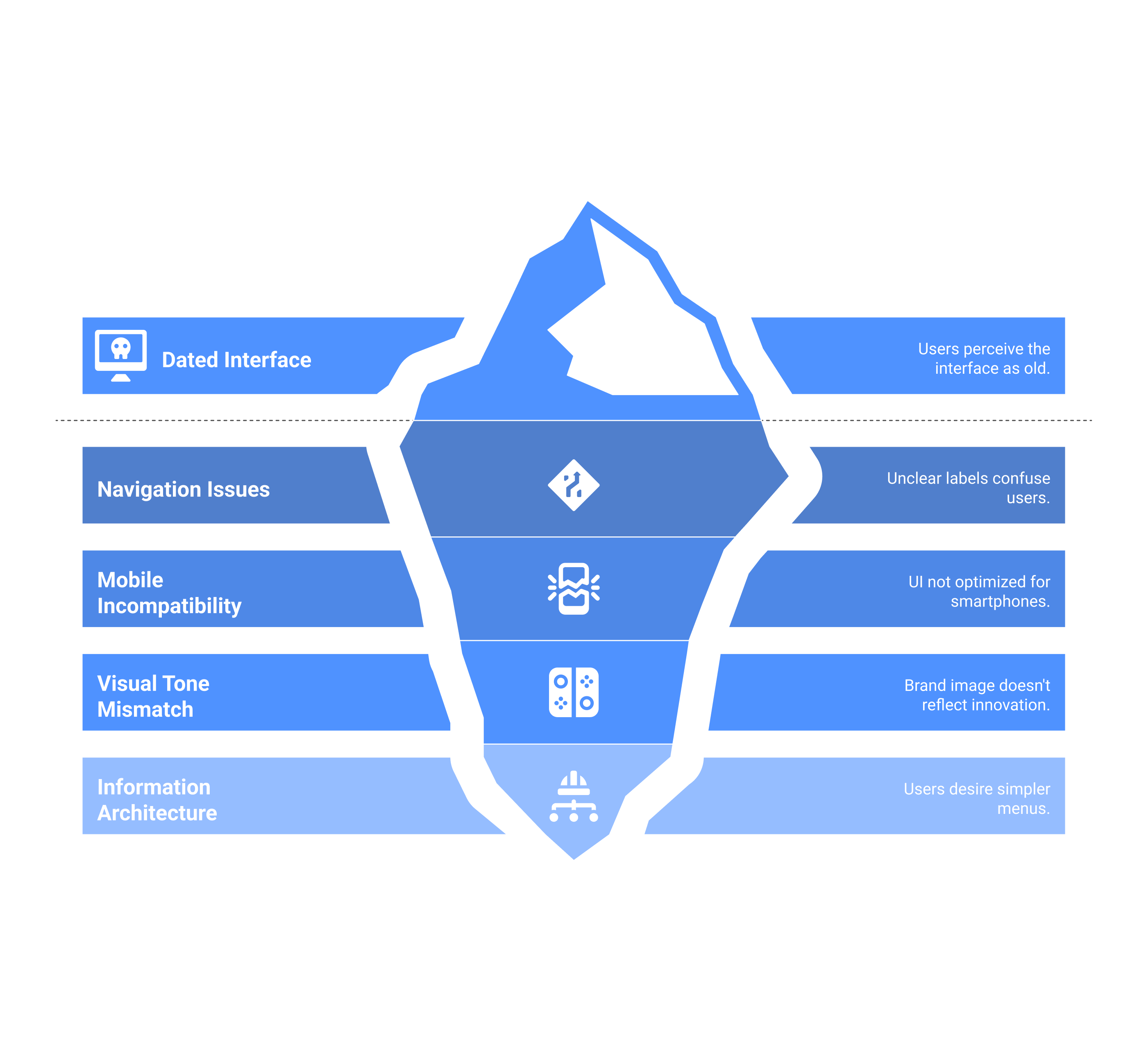
Analysis of interviews and tests revealed that users trusted the platform’s reliability but found the interface dated and inconsistent. Navigation labels were unclear, and the visual tone didn’t match the company’s innovative positioning.
Key Insights
Analysis of interviews and tests revealed that users trusted the platform’s reliability but found the interface dated and inconsistent. Navigation labels were unclear, and the visual tone didn’t match the company’s innovative positioning.
Design Direction
These insights informed a new design language based on simplicity, trust, and coherence. I refreshed the color palette, introduced a modular layout system, and tested early prototypes internally to ensure clarity on both desktop and mobile.
Design Direction
These insights informed a new design language based on simplicity, trust, and coherence. I refreshed the color palette, introduced a modular layout system, and tested early prototypes internally to ensure clarity on both desktop and mobile.
Key Design Decisions & Trade-offs
| Decision Point | Options Considered | Why We Chose | Impact |
|---|---|---|---|
| Brand Direction | 1. Full rebrand 2. Identity refresh 3. Keep legacy | Refreshed typography, colors, and icons while keeping the logo mark to preserve recognition. | Modernized look without disrupting brand equity. |
| Information Architecture & Navigation | 1. Keep old IA 2. Light tweaks 3. Simplify structure | Reduced top navigation and clarified labels to match how users browse products. | Simpler flow and faster access to key pages. |
| Visual Language | 1. Stock photos 2. Isometric visuals 3. Mixed media | Replaced stock images with custom isometric illustrations for clarity and personality. | Consistent style and quicker content creation. |
| Front-End | 1. Static site 2. SPA 3. PWA | Adopted a lightweight PWA with caching and optimized assets for better mobile speed. | Pages load 20% faster and mobile engagement improved. |
| Accessibility | 1. Bright warm + white text 2. Dark text on warm 3. Overlay contrast | Adjusted warm colors and added overlays to meet WCAG contrast standards. | Improved readability and visual comfort on mobile. |
| CMS Choice | 1. Custom React 2. Headless CMS 3. WordPress + Elementor | Used WordPress with shared components so non-devs could update content easily. | Faster page launches with consistent design. |
Brand Direction
Information Architecture & Navigation
Visual Language
Front-End
Accessibility
CMS Choice
Visual & Brand Identity
Visual Kit & Brand Personality
The brand identity needed to feel bold, modern, and instantly recognizable. I anchored the design on strong color blocking and clear typography to give the interface a tech-forward character. The visual language communicates confidence and accessibility, while the bright coral CTAs make interaction effortless.
The result was a strong, memorable, and modern identity that balanced energy with clarity, exactly what a tech brand needs to stand out without overwhelming users.
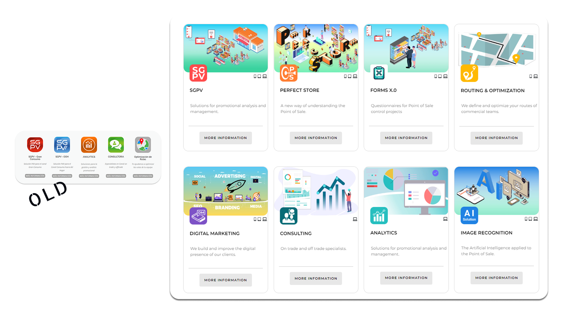
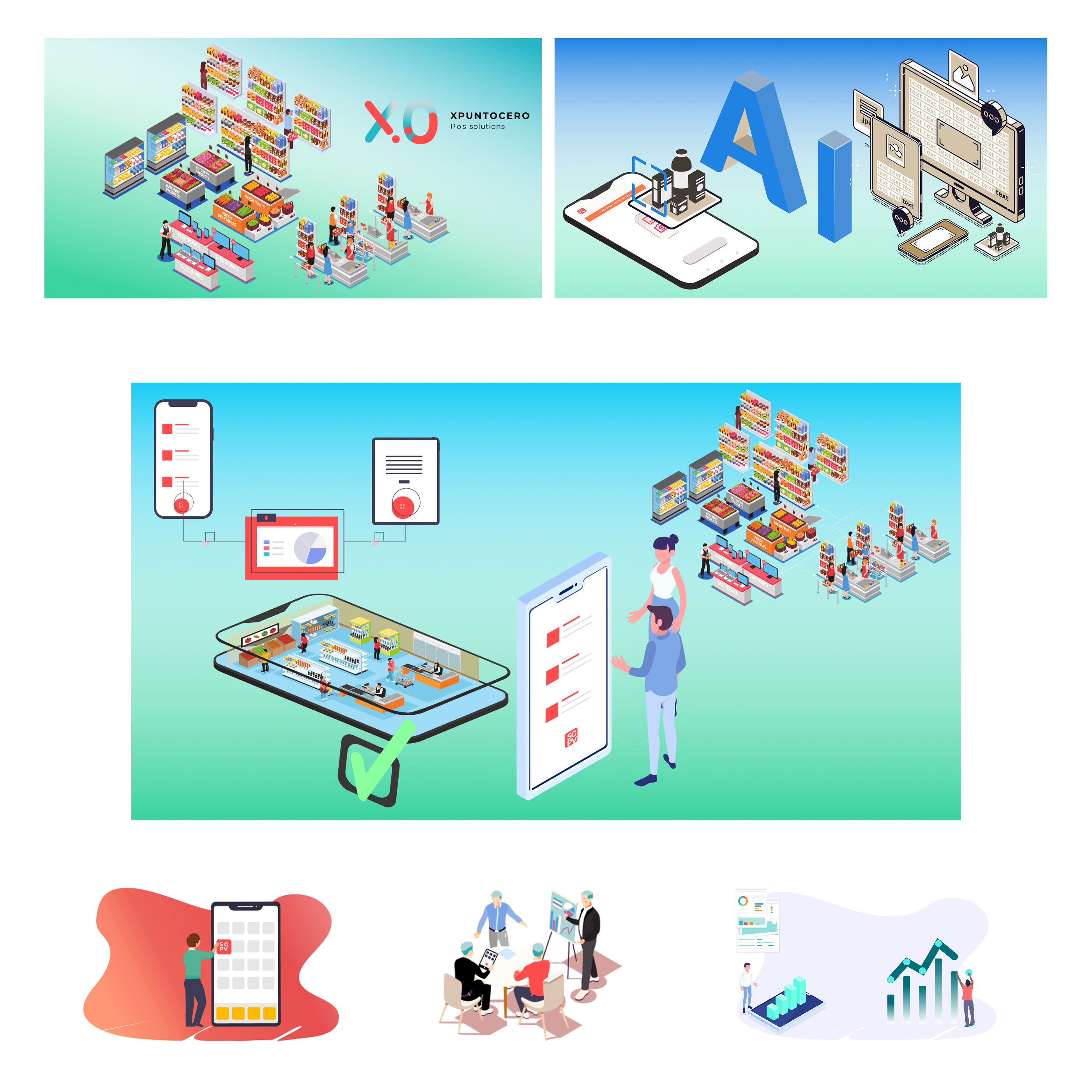
Isometric Product Illustrations
To make the product self-explanatory, I created a full set of custom isometric illustrations. Each one visualizes how XpuntoCero’s SaaS tools connect digital dashboards with real-world retail activity. The goal was for users to grasp the product’s purpose instantly, even before reading any text.
The brand relied on visual storytelling rather than lengthy explanations, making complex tools feel approachable and clear.
Outcomes & Business Impact
The redesign improved acquisition, engagement, and mobile performance while giving XpuntoCero a recognizable, modern identity that restored credibility as a SaaS provider.
Lead Generation & Marketing
Clearer messaging and improved visual hierarchy increased qualified leads by +15% and doubled demo interest.
UX & Performance
PWA architecture boosted mobile traffic by 40% and reduced load times by 20%. Users experienced smoother navigation and a more consistent brand across devices.
- • +40% mobile traffic
- • 20% faster loads
- • Higher satisfaction and engagement
Key Learnings
- → Brand perception shapes B2B trust: enterprise buyers judge credibility visually before exploring features.
- → Mobile speed matters: even B2B decision-makers browse on mobile; quick, accessible sites retain attention.
- → Visual storytelling simplifies complexity: custom isometric illustrations helped users grasp multi-product offerings instantly.
- → Early validation saves time: quick usability tests caught navigation issues before rollout.
Want to see more work?
This project demonstrates how research-driven design, cohesive branding, and performant technical implementation create measurable business impact.