Home > Product Work > VOD Platform Redesign
VOD Platform Redesign
Product Consultant · Confidential Client (MENA)
Redesigned a VOD platform for the MENA region. Reduced interaction steps by 40% through click-path analysis and brought the experience to WCAG AA compliance across TV, mobile, tablet, and in-car displays.
Evaluating & Redesigning a Multi-Device Streaming Experience
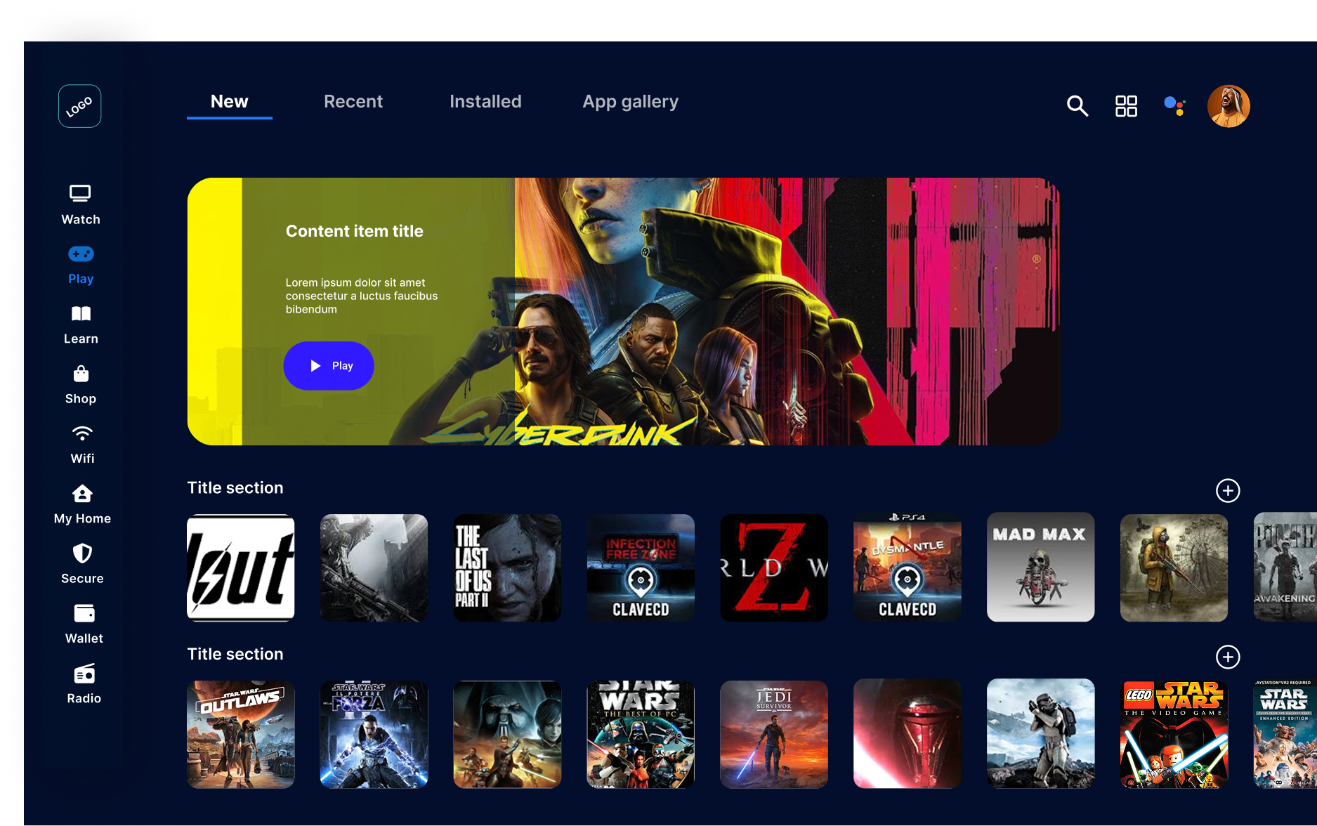
A MENA based client commissioned me to review and redesign the initial prototype of their VOD Platform. The platform needed to serve content across multiple contexts: traditional TV viewing, mobile on-the-go, tablet browsing, and in-car entertainment systems.
My role was to evaluate usability, visual clarity, and interaction flow through heuristic review, identify accessibility gaps against WCAG standards, and propose a unified home screen concept that could scale across all devices while reducing user friction.
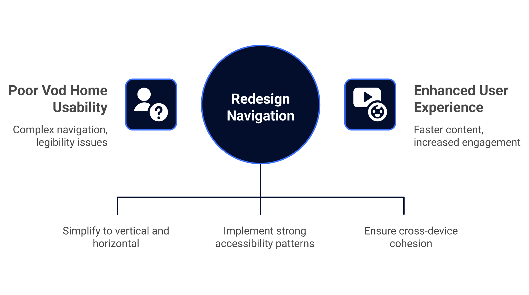
The Challenge
My Role
Product Design Consultant
- • Heuristic evaluation & accessibility audit
- • Cross-platform design strategy (TV, mobile, tablet, car)
Impact
- • 40% reduction in interaction steps
- • WCAG AA compliant accessibility
- • Unified design language across devices
- • 60% faster profile switching
Redesign Impact
Design Evolution
Business Context
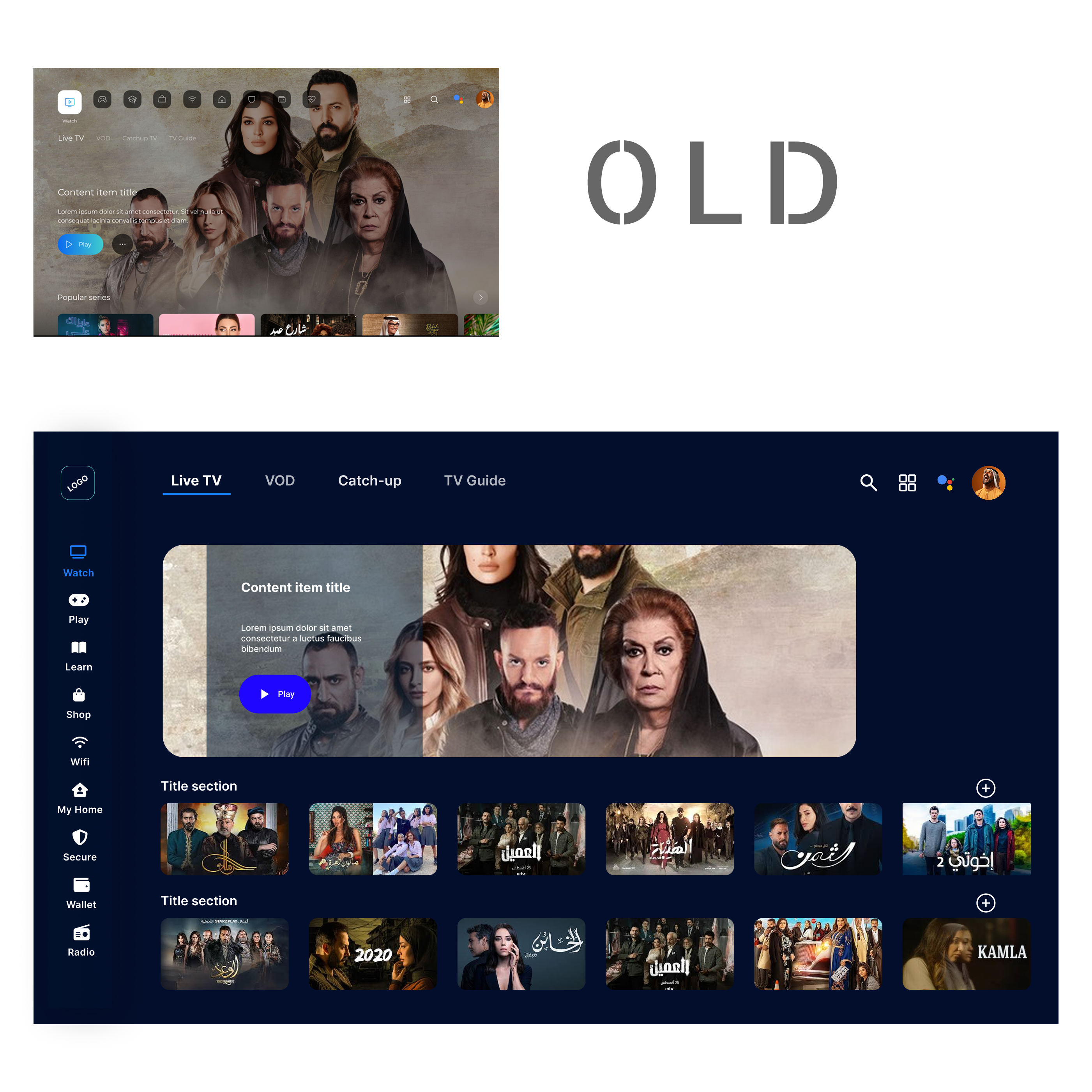
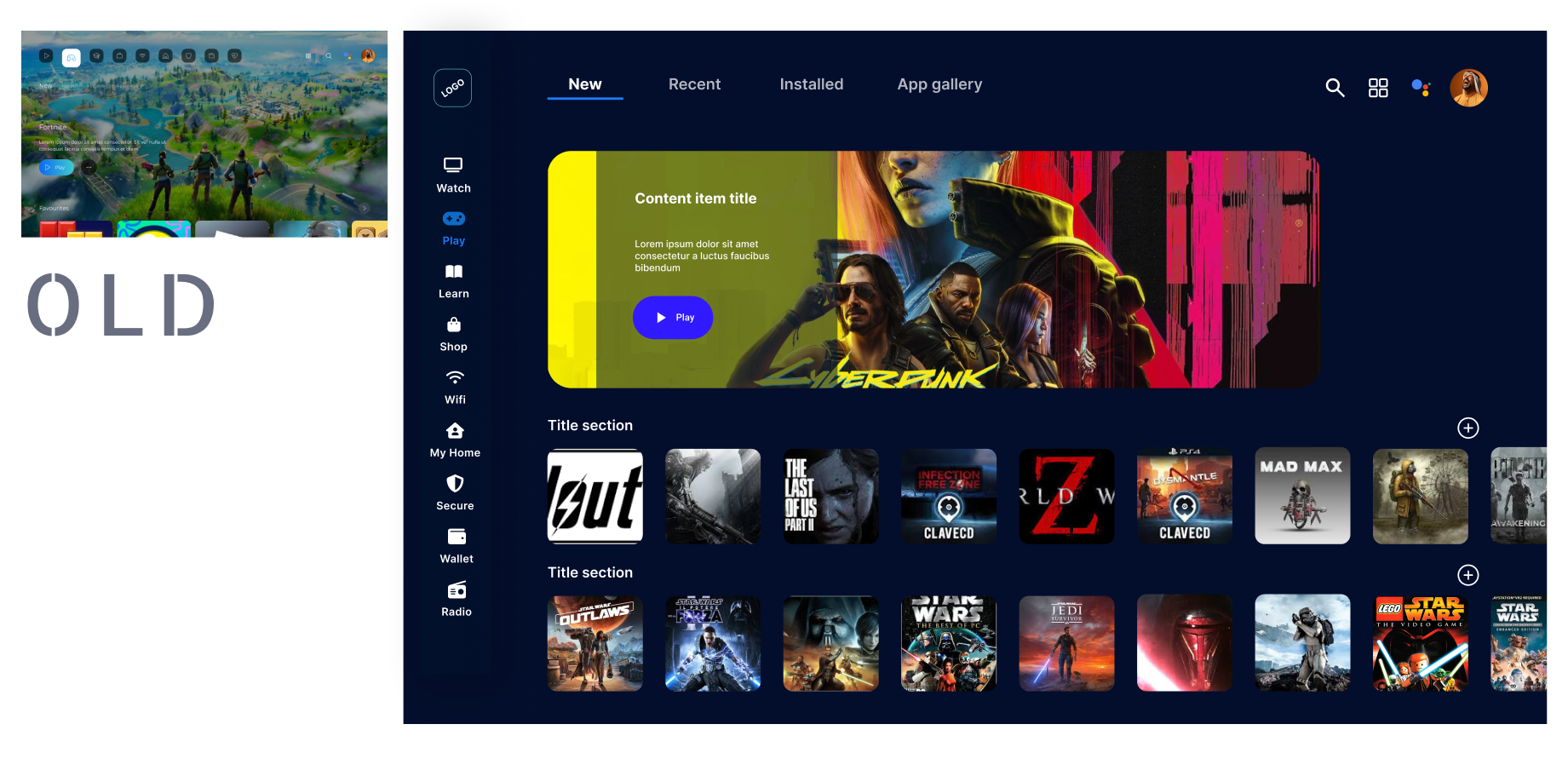
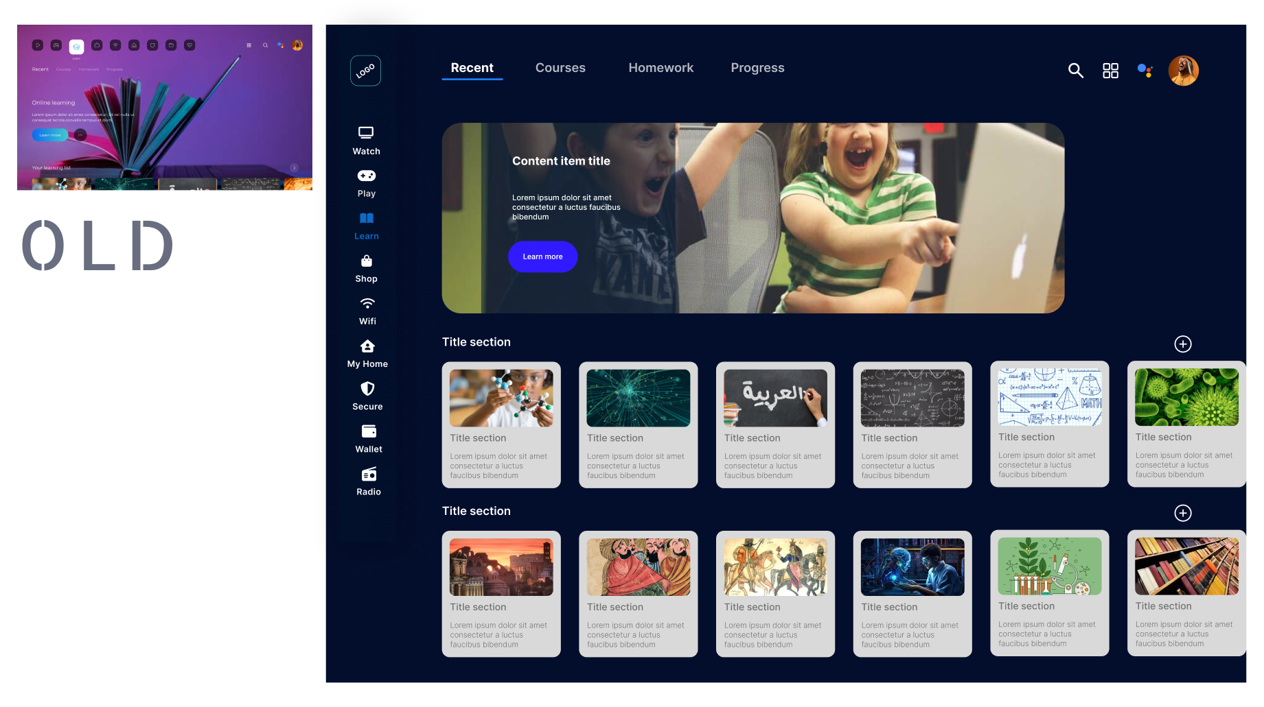
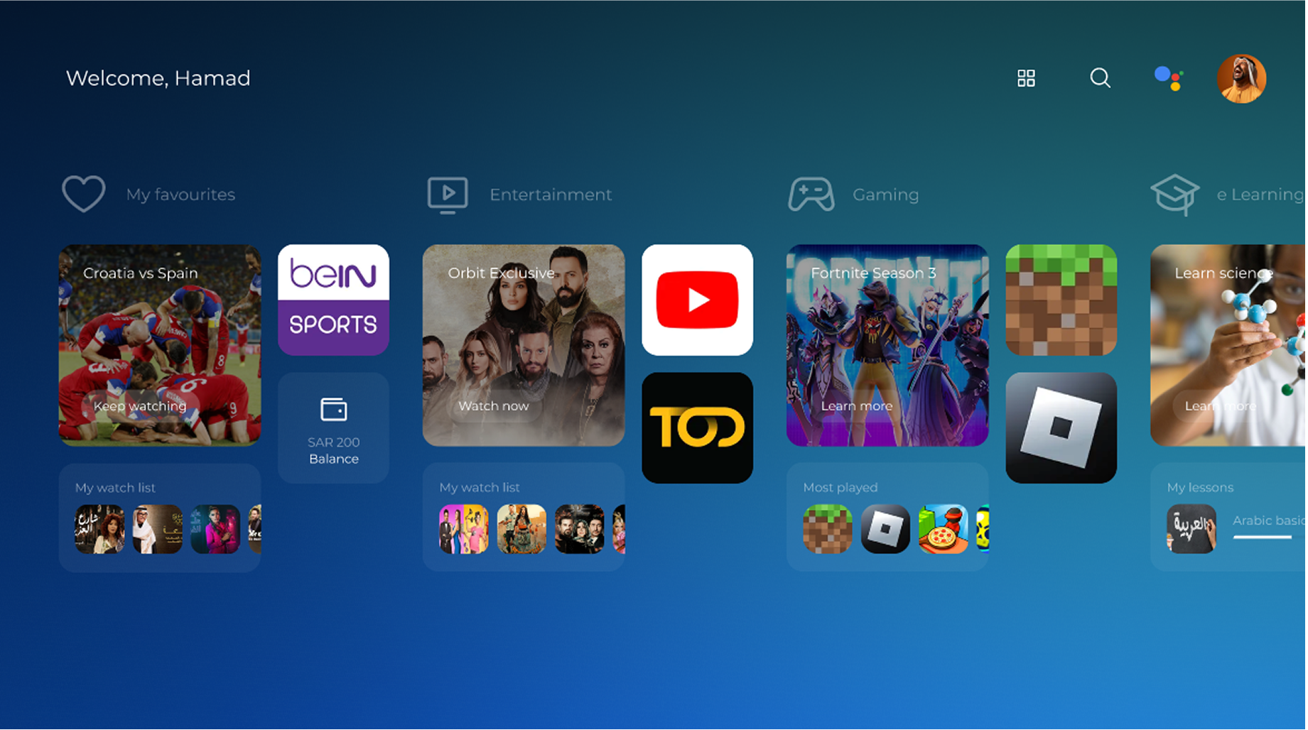
A MENA based client was building a VOD platform to compete with Netflix and Disney+ in the region. The prototype had a lot of features, but users got lost in a three-layer navigation system (icon belt, tab row, carousels). Light text over images created poor contrast. Focus indicators were too weak for TV viewing from 3 meters away. And the "Who's watching?" welcome screen blocked users from accessing content.
The MENA streaming market was getting crowded with global players. Users expected Netflix-level usability, but localized for regional preferences. The platform needed to work across TV, mobile, tablet, and in-car displays without feeling fragmented.
The Problem & Evaluation
Heuristic Review Findings
I ran a heuristic evaluation to figure out why the interface felt clunky. The issues weren't just visual. The interaction model itself was broken:
I mapped click-paths for common tasks to quantify the problem. Switching from "Watch > Live TV" to "Shop > Groceries" took 9 button presses on a TV remote. Opening the profile switcher from deep in content took over 10 presses.
Accessibility Gaps
The accessibility audit found several WCAG violations. Contrast ratios were too low, focus indicators were nearly invisible, and touch targets were under 44px. These issues hurt everyone, not just users with disabilities. Try watching TV from 3 meters away with weak focus states and you'll see the problem.
Key Decisions & Trade-offs
| Decision Point | Options Considered | Why We Chose | Impact |
|---|---|---|---|
| Navigation Architecture | 1. Keep 3-axis system 2. Reduce to 2-axis (vertical + horizontal) 3. Single axis with deep menus | Vertical rail for primary sections, horizontal tabs for filtering within each section. This 2-axis model reduced remote clicks by 40% and works across TV, mobile, tablet, and car with the same logic. | 40% reduction in interaction steps |
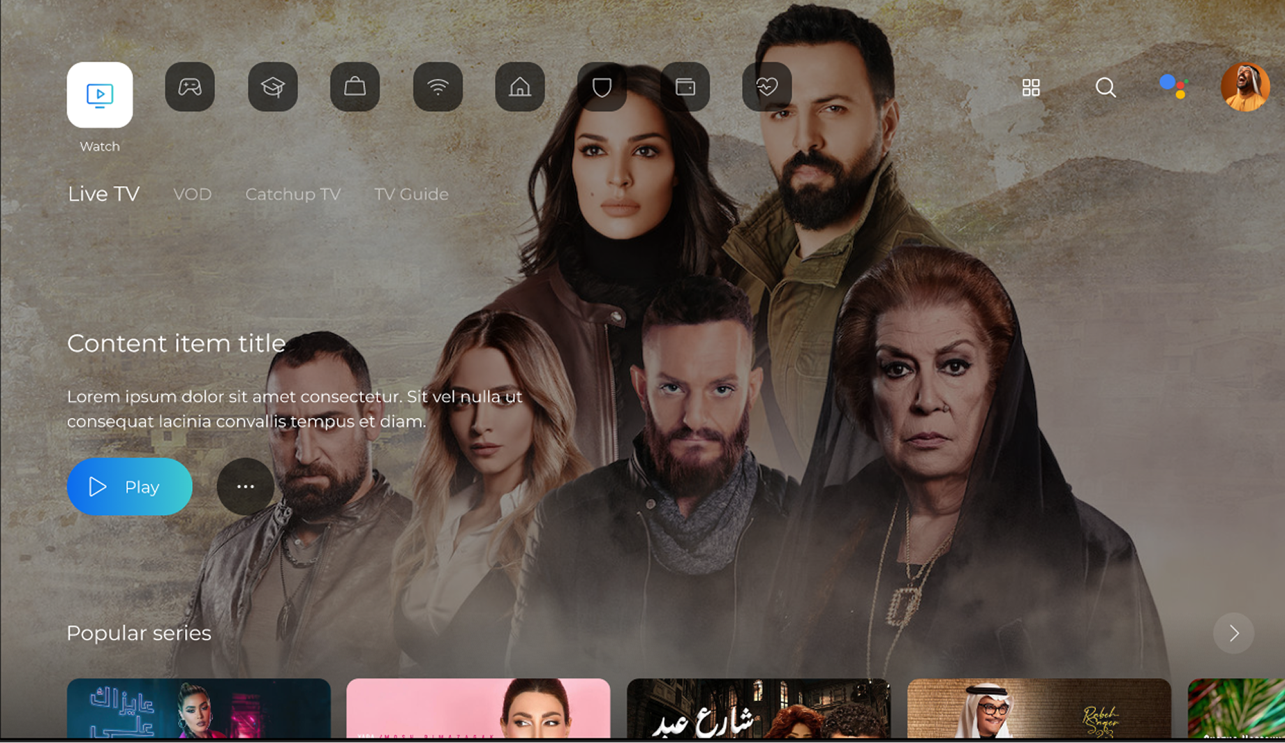
| Landing Experience | 1. Keep 'Who's watching?' gate 2. Direct to homepage 3. Direct to Continue Watching | Profile switching happens 10x less than browsing, so I moved it to the utility bar and removed the welcome gate. Users now land directly on Continue Watching | 60% faster profile access |
| Accessibility Standards | 1. Basic contrast fixes 2. WCAG AA compliance 3. WCAG AAA compliance | WCAG AA gives you solid accessibility without the extreme constraints of AAA. It's critical for TV viewing from 3 meters away - if you can't see the focus indicator from your couch, the interface is broken. | WCAG AA compliant |
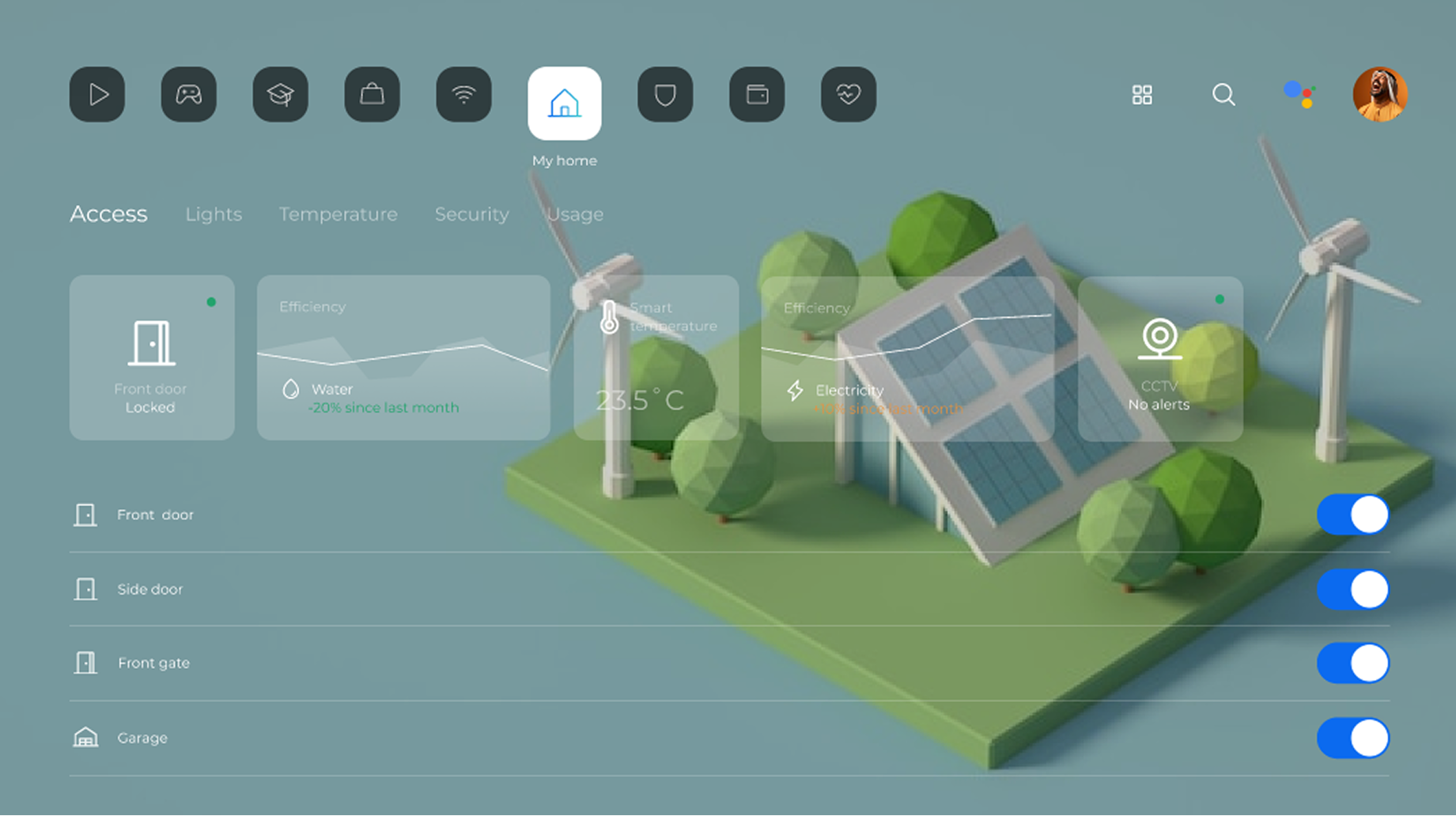
| Component System Approach | 1. Device-specific designs 2. Responsive single design 3. Adaptive box-first grid | The component grid maintains visual consistency across all platforms while respecting each device's interaction model (D-pad for TV, touch for mobile/car, hybrid for tablet). | Unified design language |
Navigation Architecture
Landing Experience
Accessibility Standards
Component System Approach
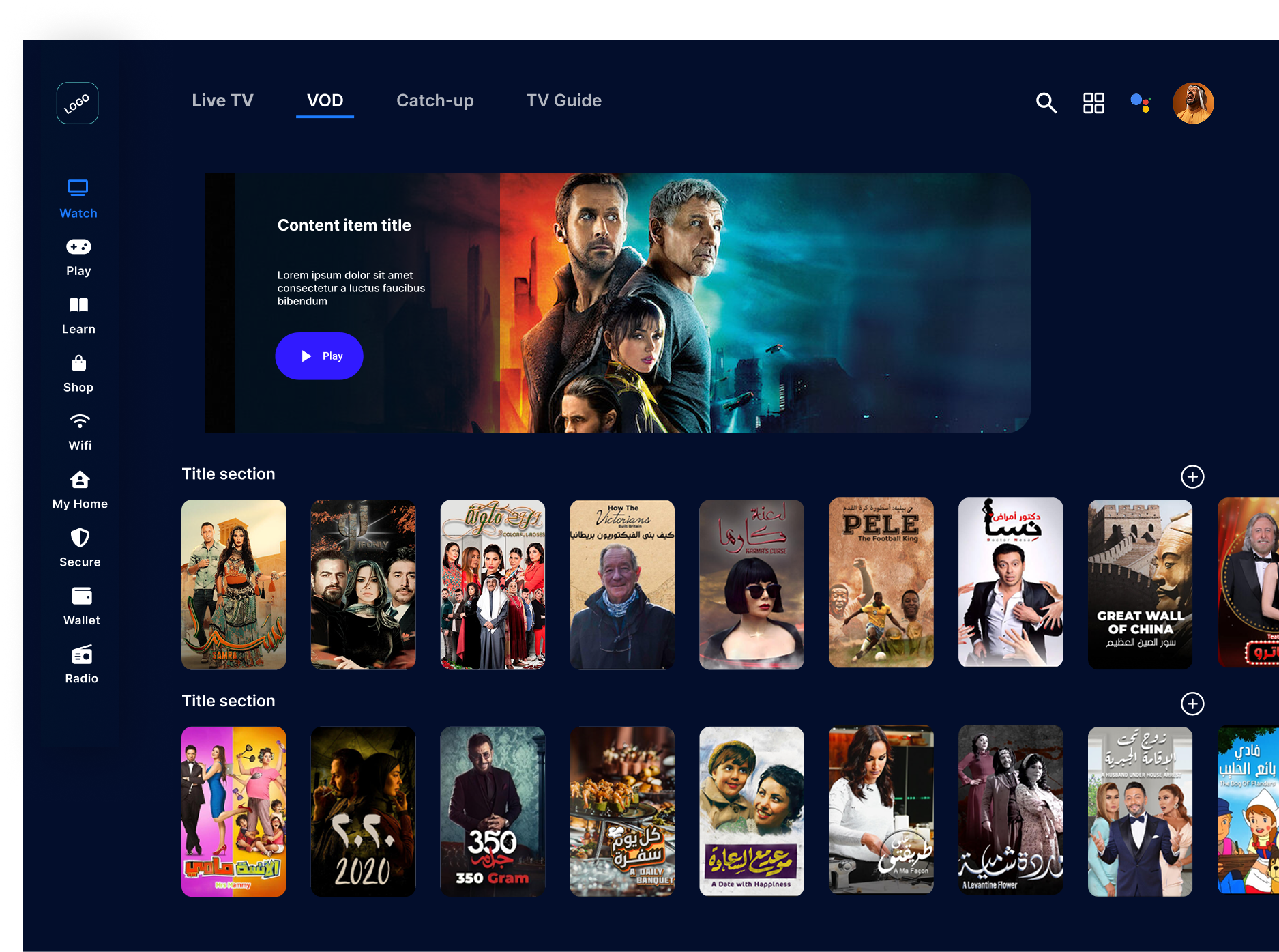
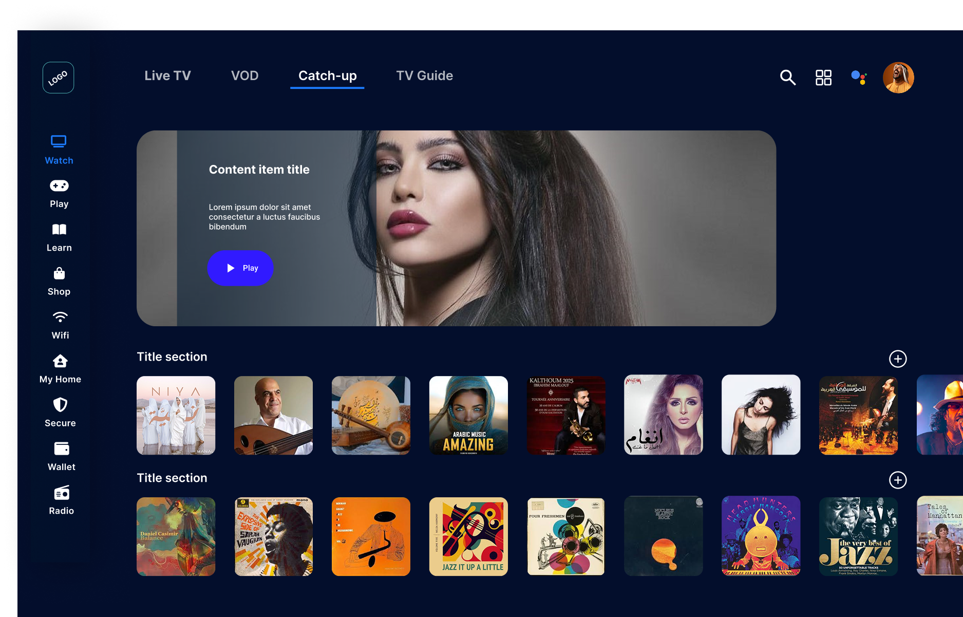
The Redesign Solution
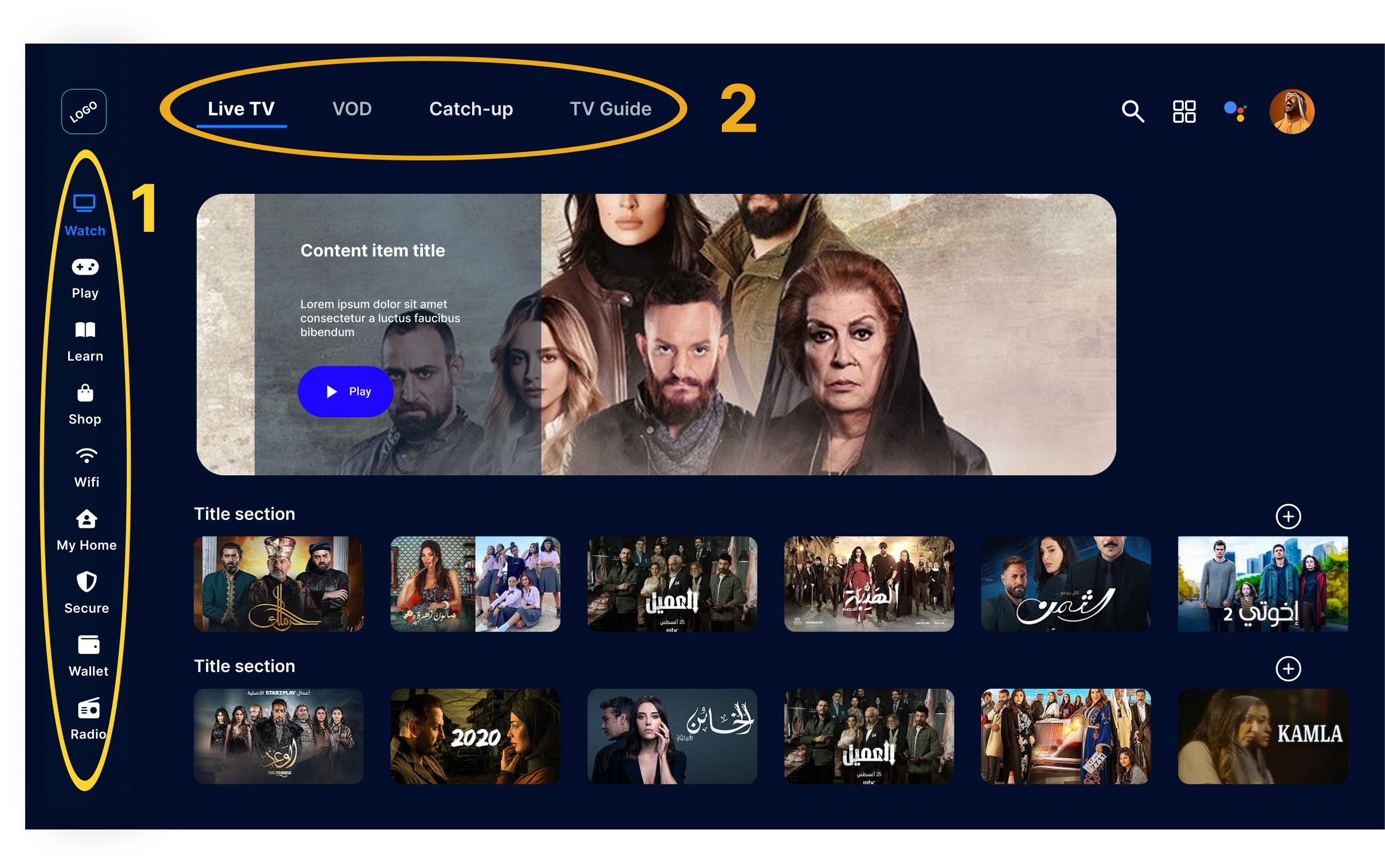
2-Axis Navigation System
- •Vertical rail stays visible across all screens for wayfinding
- •Horizontal tabs filter content within each section
- •Clear mental model: vertical for "where," horizontal for "what"
Removed Welcome Screen Friction
- •Instant access to content without gates
- •Profile switcher in persistent top-right utility bar
- •Continue Watching is now the landing page
WCAG AA Compliance
- •Contrast ratios of 4.5:1+ for all text elements
- •Bold focus states with 3:1+ contrast against backgrounds
- •Color-blind safe iconography and information architecture
- •Touch targets sized at 44x44px minimum for mobile
Box-First Component Grid
- •Adaptive grid scales from 5" phones to 75" TVs
- •Platform-specific interaction patterns (D-pad vs touch)
- •Consistent visual language across all devices
Navigation System Deep Dive
A detailed comparison of the old 3-axis vs new 2-axis navigation system
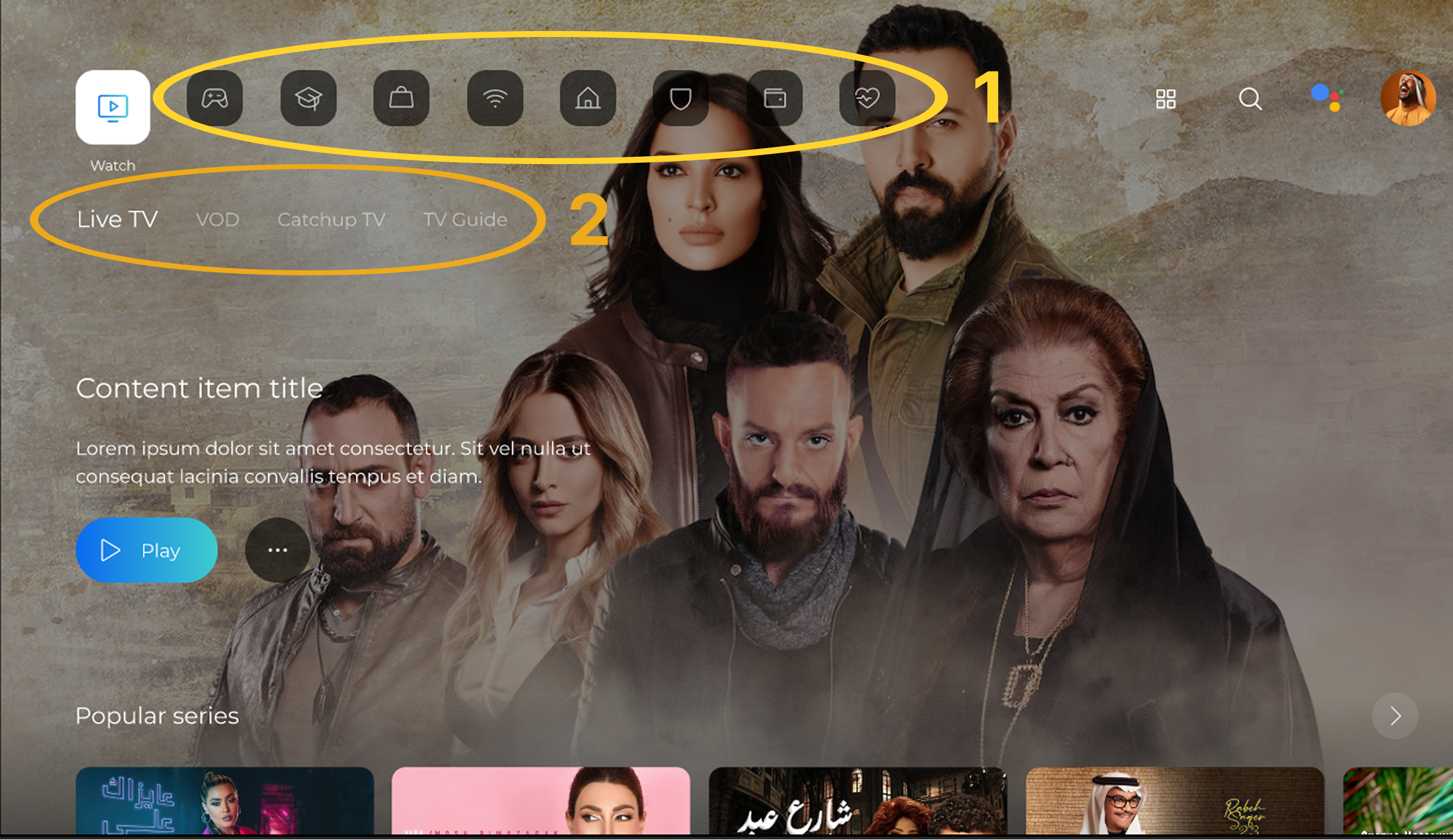
🟥 Old Navigation (3-Axis)
🟦 New Navigation (2-Axis)
Structure
1️⃣ Top icon belt — horizontal row (Home, Games, Learning, Shop…)
2️⃣ Second horizontal tab row — (Live TV, VOD, Catch-up, TV Guide)
3️⃣ Content rows — horizontal carousels of shows/movies
1️⃣ Vertical rail (left) — primary sections (Watch, Play, Learn, Shop…)
2️⃣ Top horizontal tabs — filter within the section (Live TV, VOD, Catch-up…)
Movement
⬆️⬇️ jump between stacked rows
⬅️➡️ move within each row
Zig-zag pattern due to two horizontal layers: Up → right → down → right → up → left…
⬆️⬇️ move between main sections (vertical rail)
⬅️➡️ browse tabs or content horizontally
Planar, predictable; no zig-zag.
Focus & Legibility
Weak focus; easy to lose track across layers.
Light text over artwork → poor contrast.
Persistent focus halo (+5% scale, Orbit Blue outline).
Text on 80% dark scrim → WCAG AA.
Utility & Feedback
Scattered top-right icons; no micro-interactions.
Right-aligned utility cluster (Search, Grid, AI, Avatar).
Gentle bounce/scale + soft click feedback (specified).
Outcome
Higher cognitive load; extra remote clicks.
~40% fewer interaction steps; clearer "where vs what" mental model.
Measured Interaction Improvements
I mapped click-paths before and after the redesign to measure the improvement in common TV remote tasks.
| Task (TV Example) | Original Prototype | Redesigned Flow | Improvement |
|---|---|---|---|
| Switch from Watch → Live TV to Shop → Groceries | 9 taps | 6 taps | –33% |
| Go from landing hero to first row card | 2 taps | 1 tap | –50% |
| Open profile switcher from deep in content | ≥10 taps | 4 taps | –60% |
Switch from Watch → Live TV to Shop → Groceries
Go from landing hero to first row card
Open profile switcher from deep in content
Outcomes & Deliverables
This was a consulting engagement focused on evaluation and design recommendations. I delivered mid-fidelity Figma mockups across TV, mobile, tablet, and in-car contexts, plus click-path analysis documentation.
Constraints & Trade-offs
- WCAG AA vs AAA: Chose AA to balance accessibility with design flexibility for TV viewing.
- 2-axis vs 1-axis navigation: Kept horizontal tabs because removing them would require deeper menus and increase click-paths.
- Profile switching location: Validated top-right placement by showing Netflix and Disney+ use the same pattern.
Key Learnings
- TV design requires different thinking: Focus indicators must be bold, text high-contrast, and navigation needs clear vertical/horizontal axes.
- Accessibility improvements benefit everyone: Better contrast helped users in bright rooms, stronger focus states improved TV viewing.
- Remove friction before adding features: The biggest win came from deleting the welcome screen, not adding functionality.
- Quantify interaction costs: Mapping click-paths (9 taps → 6 taps = -33%) gave stakeholders concrete proof.
Resesign game page
Want to see more work?
This is one example of how I evaluate complex products and propose solutions that balance user needs with business constraints.