Home > Product Work > TuPlanRedondo PWA
TuPlanRedondo PWA
Full-Stack Designer
I designed and built a Progressive Web App that replaced a paper-based employee evaluation process across multiple McDonald’s restaurants.
The new system reduced manual work by 30%and cut delivery costs by 45%.
Digitizing Employee Evaluations for a McDonald’s Franchise
A McDonald’s franchise needed to replace its manual evaluation forms with a centralized digital solution. While working at
While working at XpuntoCero, I led the project from user research to interface design and front-end development, delivering a lightweight Progressive Web App (PWA) that runs on any device without installation.
The app streamlined how supervisors evaluated team performance, synced results in real time, and gave management a live dashboard to track data across locations — all at a fraction of the cost of a native app.
The Challenge
The client needed a simple digital solution that worked on any device.
My Role
Product Designer & Front-End Developer
- • Led user interviews, affinity mapping, and usability testing
- • Designed all wireframes, mockups, and icons in Figma
- • Built the PWA front-end for tablets, laptops, and smartphones
- • Delivered a cost-effective digital solution that cut delivery costs by 45%
Scope
- • End-to-end research → design → development
- • Evaluation forms, dashboard, and secure login
- • Cross-device PWA built with HTML5, CSS3, Bootstrap, JS
Project Impact
Design & Development
Business Context
The McDonald’s franchise approached requesting a mobile application to digitalize employee evaluations and track performance across its restaurants. The existing process relied on printed forms and manual data entry, which made reporting slow, fragmented, and prone to errors.
Managers wanted a simple tool to collect evaluations, review results, and monitor staff performance more efficiently. The priority was to eliminate paperwork and centralize all data in a single digital system accessible during daily operations in each restaurant.
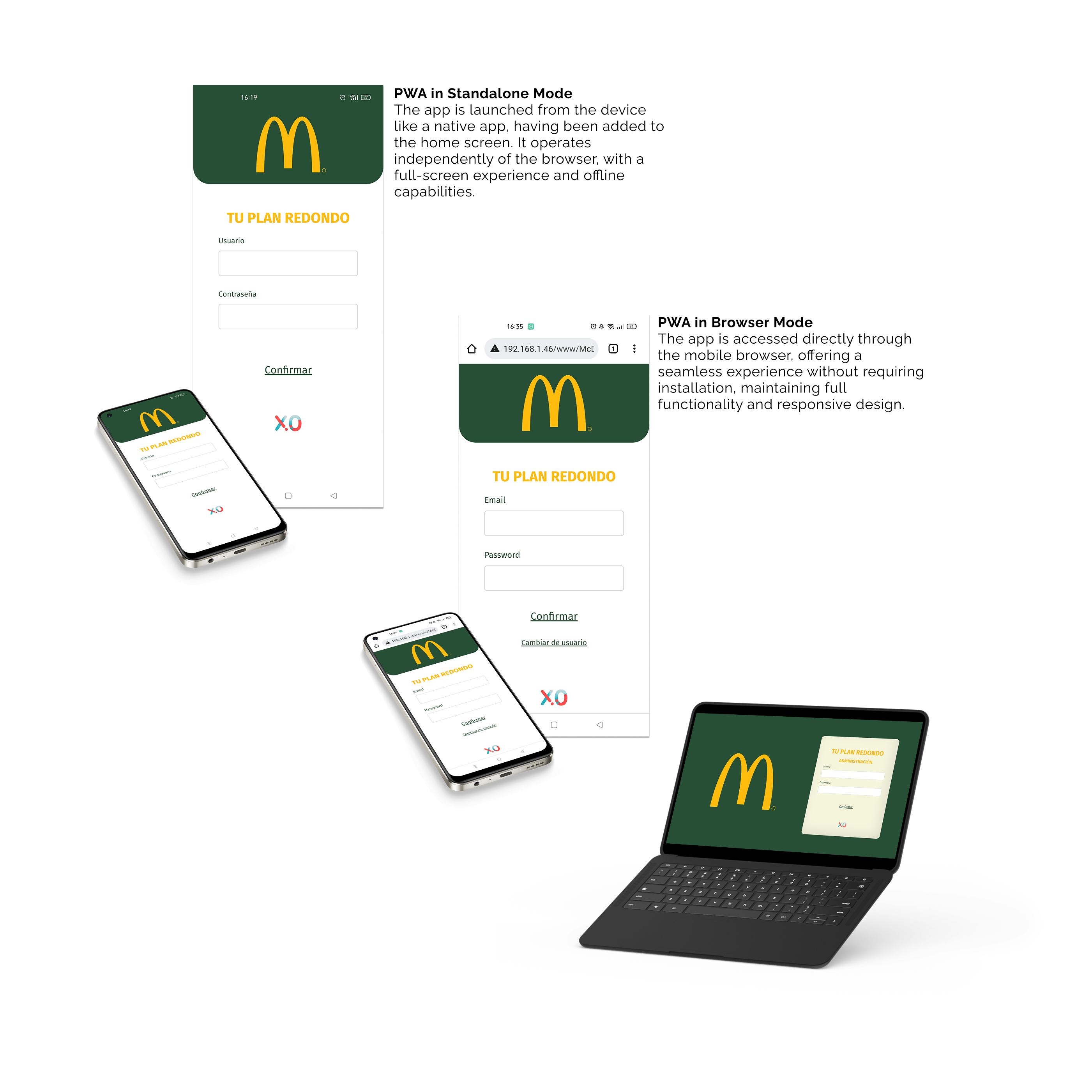
They initially asked for a native app, but after mapping their environment, we realized a PWA would solve the same problem faster, cheaper, and without app-store friction.
Research & Definition
User Research Processs
I conducted comprehensive research to understand both evaluator workflows and management reporting needs, combining qualitative interviews with iterative usability testing.
User Research Processs
I conducted comprehensive research to understand both evaluator workflows and management reporting needs, combining qualitative interviews with iterative usability testing.
Key Findings
Research revealed critical pain points that shaped the product requirements and guided the design approach.
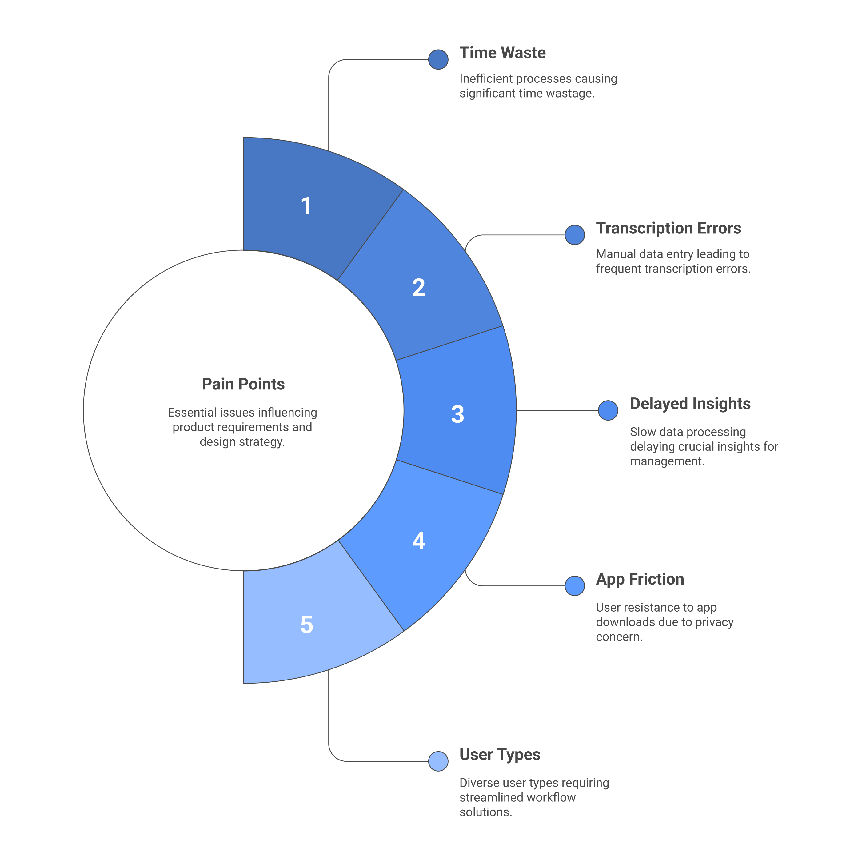
Key Findings
Research revealed critical pain points that shaped the product requirements and guided the design approach.
Key Decisions & Trade-offs
| Decision Point | Options Considered | Why We Chose | Impact |
|---|---|---|---|
| Technology Choice | 1. Native app 2. Hybrid 3. Progressive Web App (PWA) | The client asked for a native app. After assessing devices, budget, and rollout constraints, I proposed a PWA: no installs, works on any browser, faster to ship. | Delivery costs ↓ 45%; instant access on tablets, phones, laptops |
| Connectivity Strategy | 1. Offline-first 2. Basic caching 3. Online real-time | Restaurants had stable Wi-Fi. Offline would add complexity without clear value, so I optimized for fast loads and real-time submission. | Simpler maintenance; reliable performance; shorter timeline |
| Interface Scope | 1. Complex evaluation suite 2. Feature creep 3. Focused forms + dashboard | Kept the MVP tight: streamlined forms, role-based access, and a simple live dashboard for managers. | 30% less manual work; quicker adoption; easier training |
Technology Choice
Connectivity Strategy
Interface Scope
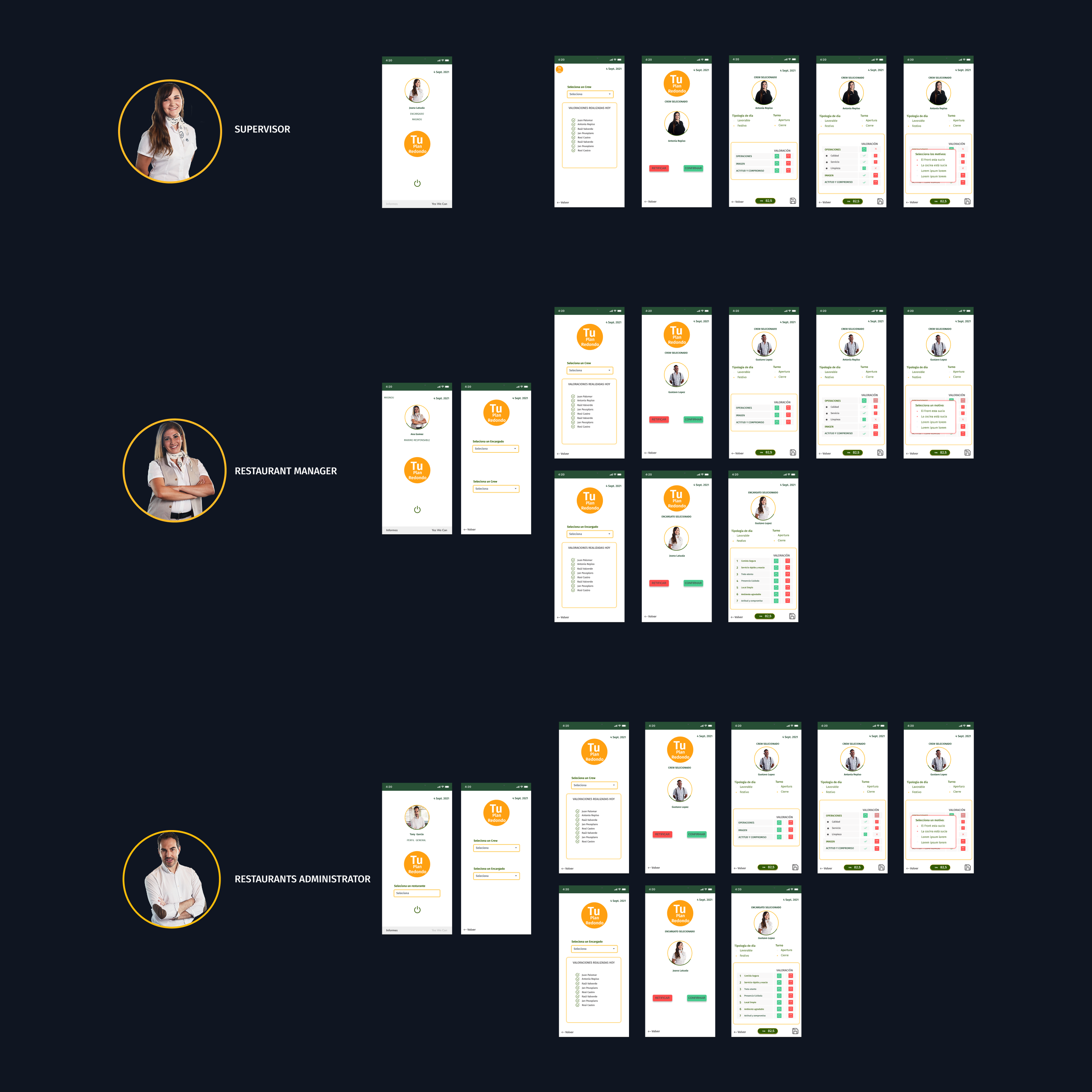
Design & Implementation
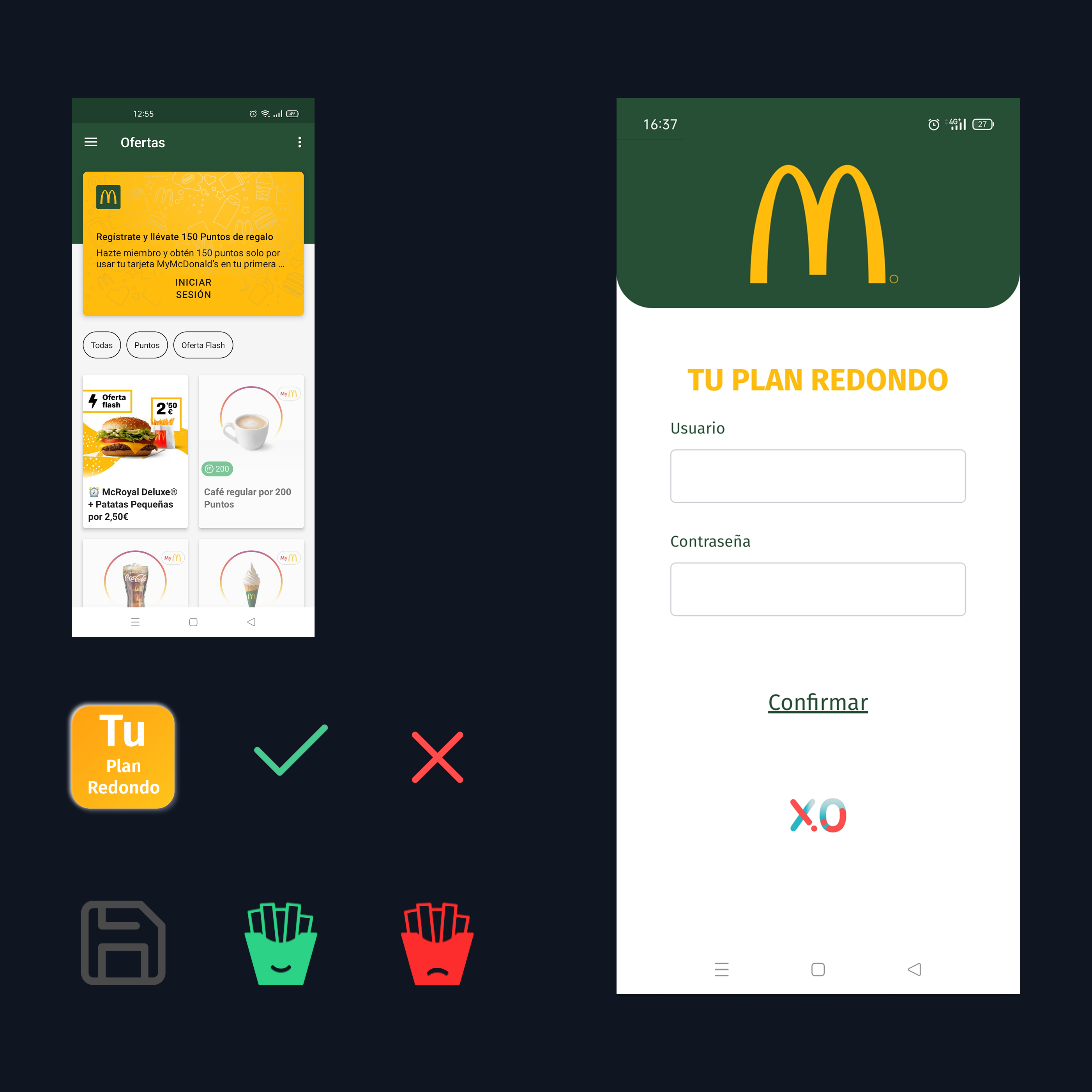
Brand-Aligned Visual Design
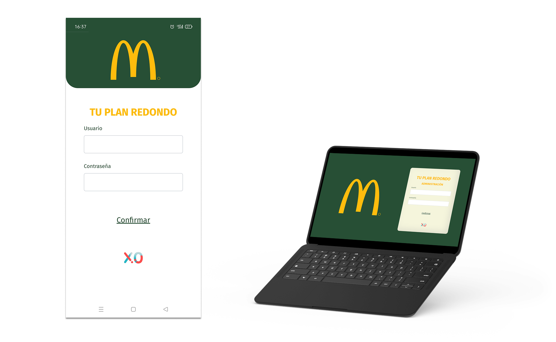
Created all icons and visual elements to align with McDonald’s brand guidelines while maintaining clarity and usability. The design balances brand recognition with functional requirements.
Brand-Aligned Visual Design
Created all icons and visual elements to align with McDonald’s brand guidelines while maintaining clarity and usability. The design balances brand recognition with functional requirements.
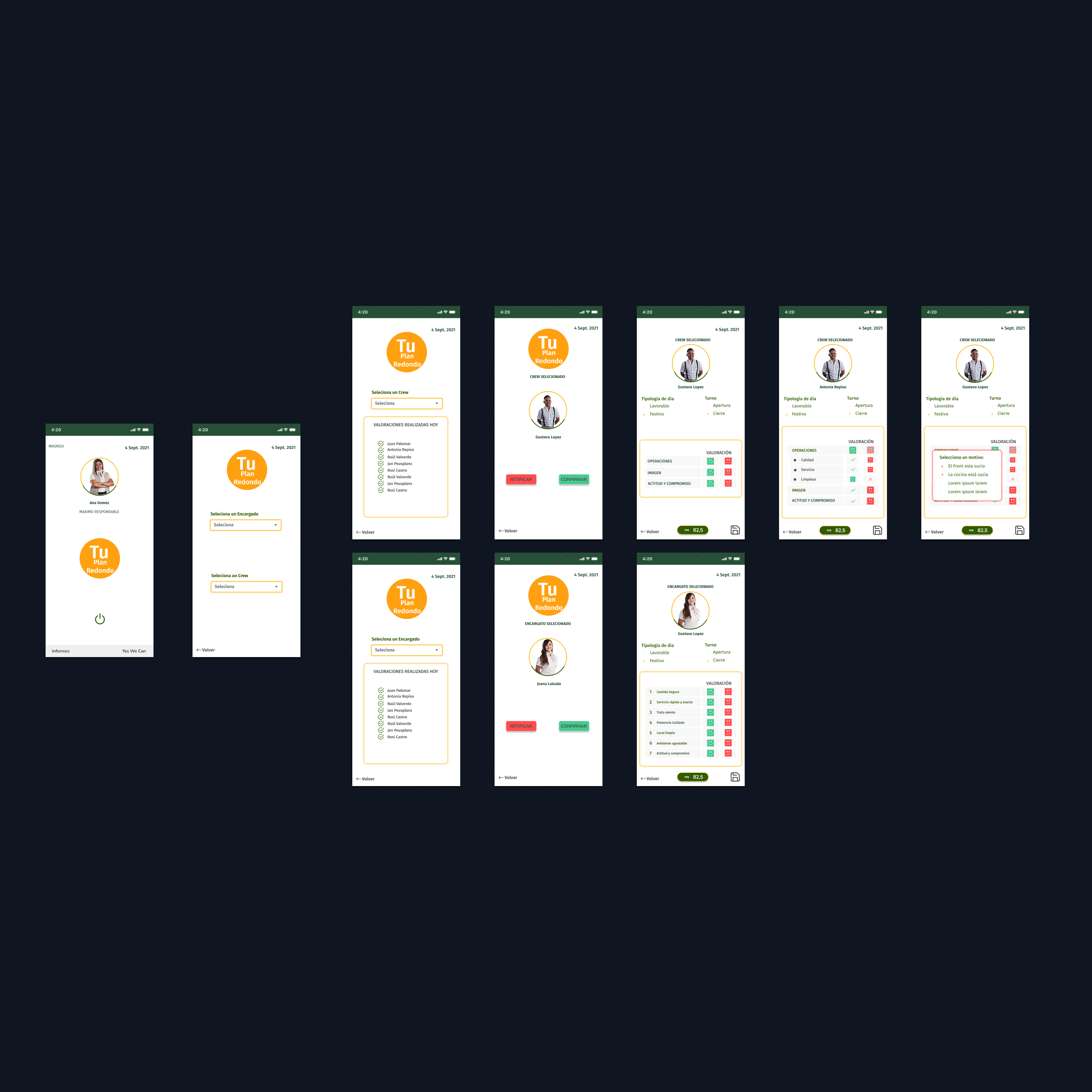
Streamlined Evaluation Interface
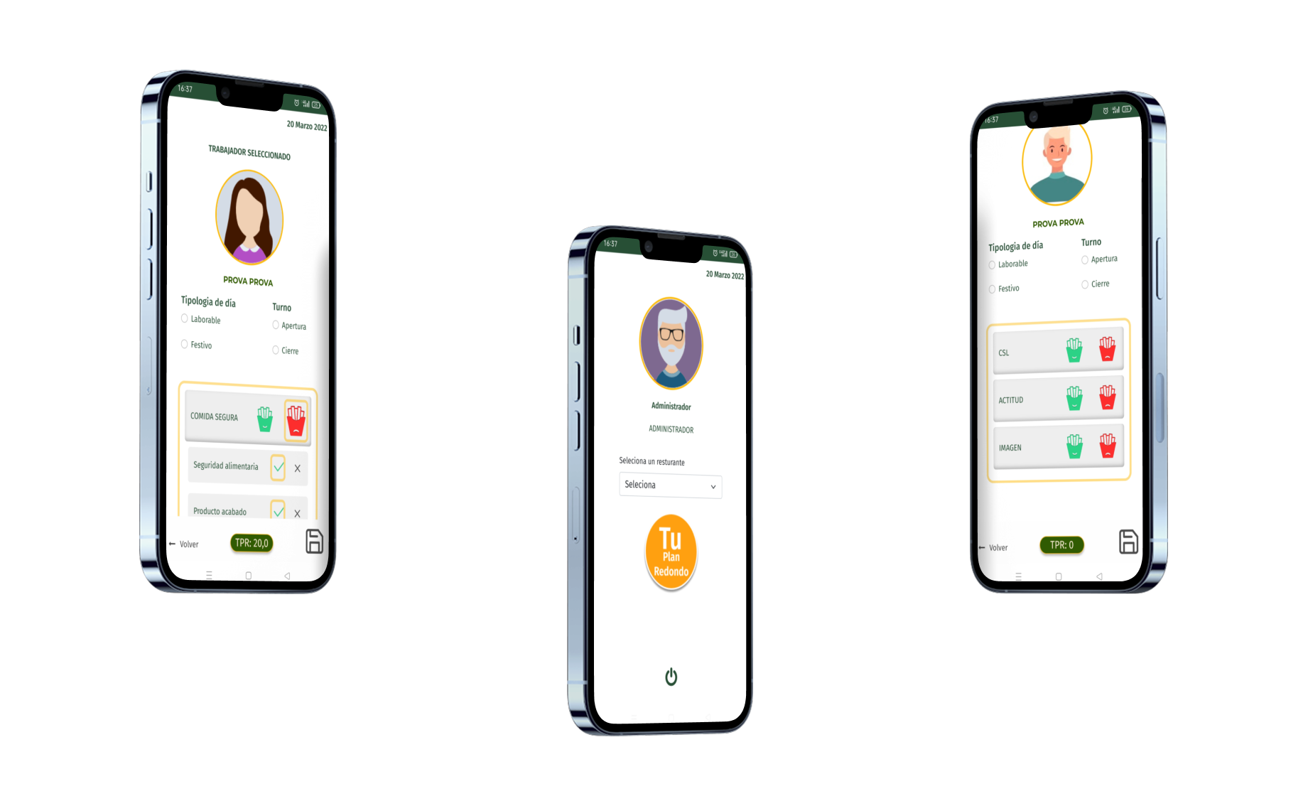
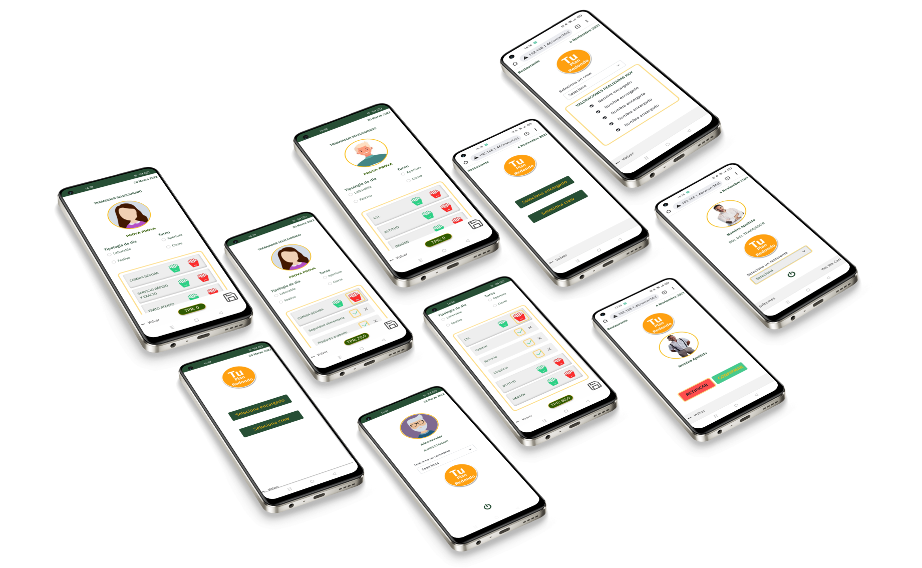
Designed evaluation forms to match the mental model of paper workflows while leveraging digital affordances. Visual indicators (thumbs up/down, color coding) enable fast data entry during observations.
Streamlined Evaluation Interface
Designed evaluation forms to match the mental model of paper workflows while leveraging digital affordances. Visual indicators (thumbs up/down, color coding) enable fast data entry during observations.
Performance Evaluation
Managers select a worker and score core McDonald’s service metrics with quick taps. Visual fries icons make scoring unambiguous during fast service.
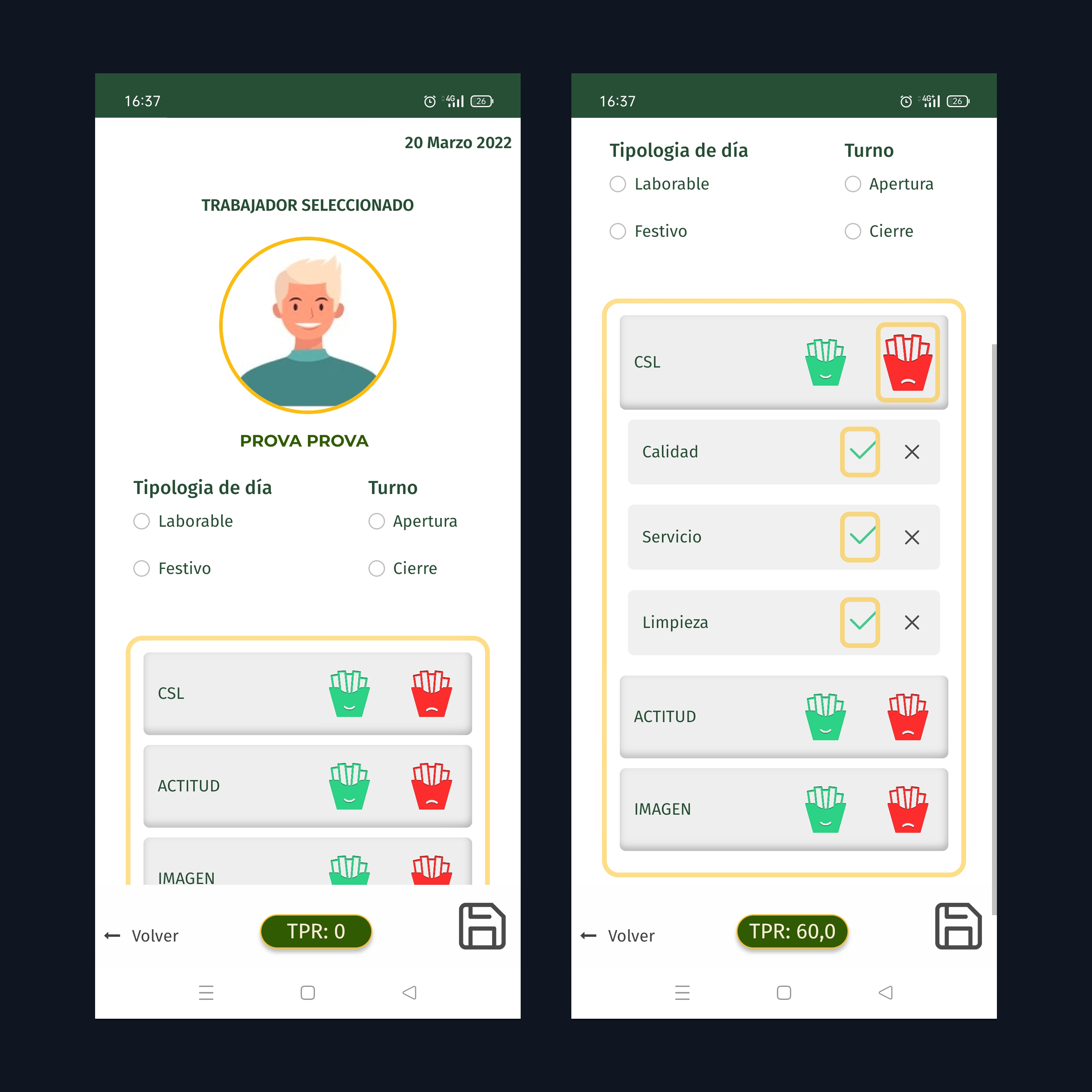
Performance Evaluation
Managers select a worker and score core McDonald’s service metrics with quick taps. Visual fries icons make scoring unambiguous during fast service.
Business Impact & Results
The PWA delivered measurable improvements in efficiency, cost, and user satisfaction while establishing a scalable foundation for future franchise operations tools.
Operational Efficiency & User Experience
- 30% time savings: Evaluations that took 30-40 minutes now complete in 20-25 minutes.
- Eliminated data entry: Zero manual transcription from paper to spreadsheets.
- 25% satisfaction increase: managers praised simplicity and speed.
Cost
- 45% cost reduction: PWA development cheaper than native iOS + Android apps.
- Cross-device compatibility: Single codebase works on tablets, phones, and laptops.
- Zero update friction: Directly ralise, no app store approval delays.
- Zero installation friction: Users access via browser or they cand add to Home screen without app store, without use the device memory.
Want to see more work?
This project demonstrates how research-driven design, cohesive branding, and performant technical implementation create measurable business impact.