Home > Product Work > Dow Jones Design System
Dow Jones Design System
Lead Design Technologist | Design System Product Owner
I co-led design system adoption across 8 brands at Dow Jones, from The Wall Street Journal to Factiva (B2C & B2B). We unified teams, reduced component complexity by 20%, and boosted productivity by 30%.
Building a Unified System at Scale
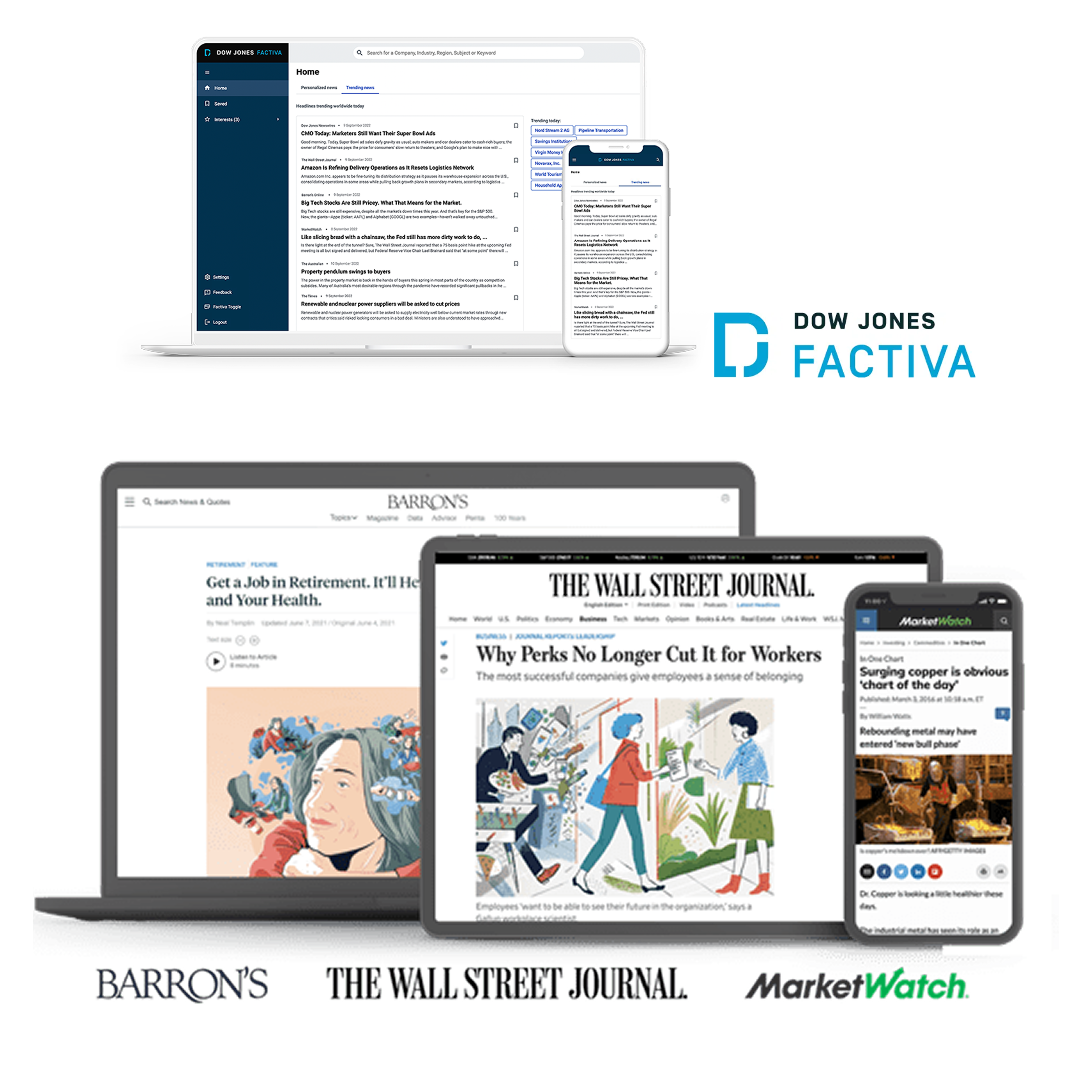
Dow Jones operates multiple B2B and B2C brands including The Wall Street Journal, Barron's, MarketWatch and Factiva (B2B), with more in the pipeline (B2C and B2B). Each brand had evolved independently with its own design team, which drove rapid innovation and brand-specific optimization. As the company scaled, the opportunity emerged to unify these learnings into a shared foundation while preserving each brand's unique identity.
As Lead Design Technologist and Product Owner for the design system, I co-owned the product roadmap with design and engineering leadership. The challenge was establishing governance that 8 autonomous brands would embrace, not as a constraint, but as an accelerator.
We succeeded by reorganizing the architecture (20% less complexity), streamlining workflows (30% productivity boost), and embedding accessibility (WCAG 2.2) from day one. Today, the system powers 200K+ component instances used by 60+ designers and 120+ engineers across web, iOS, and Android.
The Challenge
My Role
Lead Design Technologist
- • Product roadmap co-ownership
- • Design system governance
- • Component architecture
- • Stakeholder alignment & conflict resolution
- • Bridge between design vision and technical implementation
Scope
Team Adoption & Scale
Who uses the system and where it's deployed
Project Gallery
Business Context
From Autonomy to Unified Scale
As Dow Jones grew its portfolio—The Wall Street Journal, Barron's, MarketWatch, Factiva, and more—each brand developed its own design approaches and workflows. This autonomy was a strength: teams moved fast, optimized for their specific audiences, and built strong brand identities.
The opportunity emerged as the company scaled: could we preserve that brand autonomy while creating a shared foundation that would accelerate everyone? The goal wasn't to standardize everything. It was to enable teams to move faster by solving common problems once, then customizing where it mattered.
What we needed:
- •A governance model that brands would adopt voluntarily (not mandated from above)
- •Technical architecture flexible enough to support B2C and B2B contexts
- •A system that preserved brand identity while enabling cross-brand efficiency
Governance & Architecture
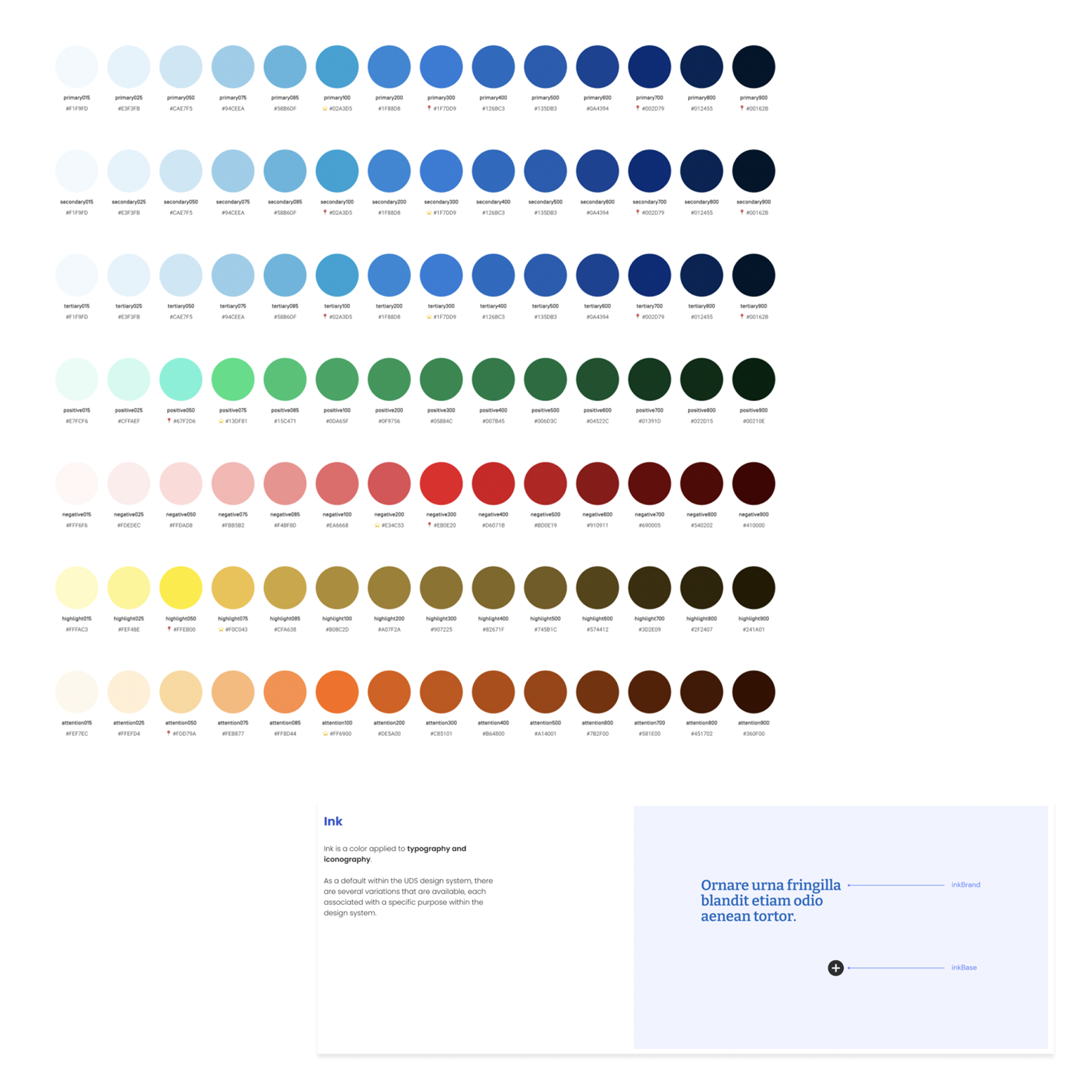
Token-First Architecture
Our team proposed a token-first strategy to enable multi-brand scale. Design tokens are variables that store foundational design attributes: colors, spacing, typography, shadows. Think of them like Lego bricks. You build the component structure once (the brick shape), then snap on different tokens (colors and styles) to create brand-specific versions.
All brands use the same token structure, but each assigns different values. For example, "Ink" is a token family for typography and iconography. Within that family, there are specific tokens like InkBrand. Both The Wall Street Journal and Factiva have the same Ink family with the same InkBrand token, but each brand assigns different values to it. Same structure, different brand expression.
My role was bridging the technical vision with designers and stakeholders, helping them understand how "variables" would speed up their work. Many struggled with the abstraction, so I translated it simply: "Design once, the system adapts it to every brand automatically." I also worked with teams when system rules felt too strict, explaining the reasoning behind governance decisions and helping stakeholders see why consistency mattered for long-term scale.
What this enabled:
- •Migrated to platform-agnostic Style Dictionary (one source for web, iOS, and Android)
- •Automated token distribution via CI/CD (designers update Figma, tokens flow to all platforms)
- •Single source of truth for visual properties (no more "which blue?" debates)
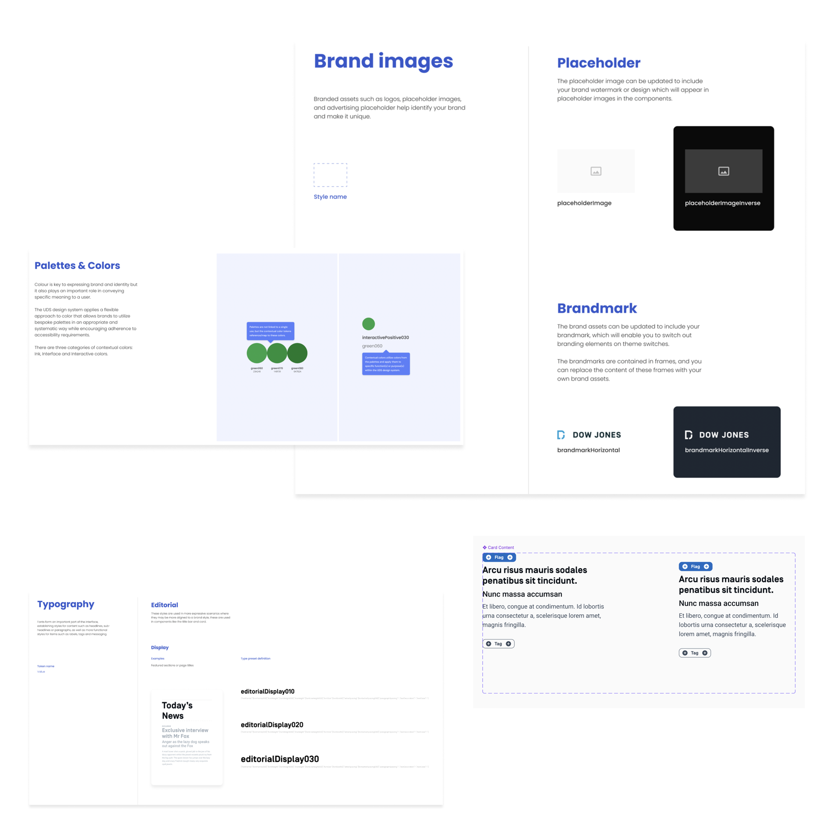
- •White-label theming and dark mode without rebuilding components
Instead of 8 separate design systems, we had one flexible system expressing 8+ brand identities. The technical architecture made it possible; my role was ensuring adoption and governance.
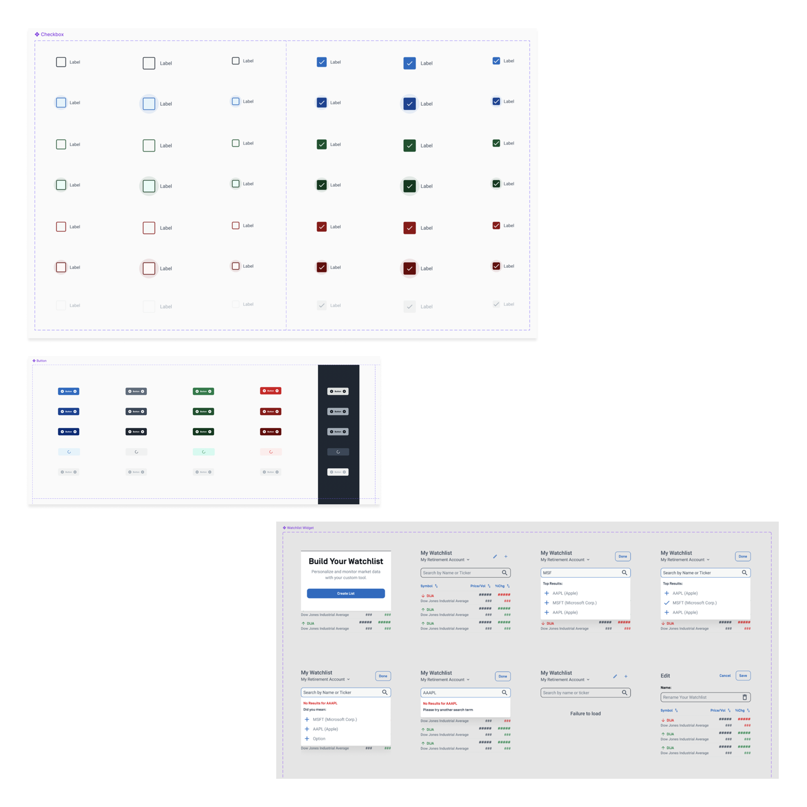
Repository & Documentation Overhaul
Led the reorganization of core repositories and Storybook architecture, reducing component complexity by 20% and dramatically improving discoverability for both engineers and designers. This wasn't just technical cleanup. It required careful coordination across 8 brands.
I moderated every handoff and pre-handoff session, acting as problem solver when brand-specific needs conflicted with system-wide goals. These sessions were where the real governance work happened: finding solutions that satisfied individual brand requirements while maintaining system integrity.
Results:
- •Improved component organization and documentation structure
- •Streamlined contribution workflows and approval processes
- •Facilitated handoff sessions as moderator, resolving conflicts between brand needs and system goals
- •Faster onboarding (new team members reached productivity sooner)
Key Decisions & Trade-offs
| Decision Point | Options Considered | Why We Chose | Impact |
|---|---|---|---|
| Governance Model | 1. Centralized team 2. Distributed contributors 3. Hybrid model | Hybrid approach balanced central oversight with brand autonomy. Brands contributed to the system while maintaining their unique identities. This voluntary adoption model was critical. | All 8 brands adopted the system |
| Platform Architecture | 1. React-only 2. Native per platform 3. Token-based cross-platform | Token-first strategy using Style Dictionary enabled one source of truth across web, iOS, and Android. This unlocked multi-brand theming and dark mode without rebuilding components. | Cross-platform consistency |
| Component Complexity | 1. Simple atoms only 2. Complex compositions 3. Tiered system | Tiered system with reorganized Storybook architecture provided flexibility while maintaining consistency. Improved discoverability for 60+ designers and 120+ engineers. | 20% complexity reduction |
| Documentation & Workflow Strategy | 1. Code comments 2. Separate docs site 3. Integrated Storybook + process optimization | Storybook integration kept docs close to code, increasing usage and reducing maintenance burden. I also improved team workflows for handoffs, UAT, QA, and design acceptance, streamlining how designers and engineers collaborated. | 30% productivity boost |
Governance Model
Platform Architecture
Component Complexity
Documentation & Workflow Strategy
How We Worked: Process, Quality & Collaboration
Cross-Functional Partnership
Partnered with over 120 stakeholders from product, engineering, and accessibility teams to ensure scalable implementation and alignment across all brands.
What this looked like:
- •Collaborated with analytics teams using Google Analytics and internal dashboards to inform product improvements and support data-driven prioritization
- •Demonstrated a "make things happen" mindset through ownership and speed (no waiting for perfect conditions)
- •Regular sync meetings across time zones to keep 8+ brands aligned
Accessibility & Quality
Ensured accessibility (A11y) best practices were embedded into the design system from day one, meeting EU and U.S. compliance standards (WCAG 2.2). This wasn't a checklist. It was baked into our workflow.
How we validated:
- •Collaborated with the accessibility lead on validation strategy and testing protocols
- •Facilitated alignment between design, engineering, and accessibility teams on component compliance
- •Improved workflows for accessibility review and design acceptance
AI-Assisted Workflow
I used AI throughout this work. ChatGPT and Vertex AI for speeding up documentation, component specs, and prototyping. Also automated quality checks and consistency validation. It's not magic, but it does let you iterate faster and catch more issues.
Business Outcomes
How the system improved velocity and quality
The design system contributed to improved UX consistency across all Dow Jones digital properties, reduced friction in user journeys, and delivered measurable gains in how teams work. The system enabled scalable cross-platform development and faster time-to-market for new features.
Productivity Boost
Streamlined workflows, improved documentation, and reduced design-to-code inconsistency. Teams spend less time reinventing solutions and more time solving user problems.
How we got there:
- • Better Storybook organization makes component discovery faster
- • Token automation eliminates manual sync between design and code
- • Clear contribution guidelines reduce back-and-forth in reviews
Complexity Reduction
Repository reorganization and architectural simplification made the system easier to maintain and extend. Simpler code means fewer bugs and faster onboarding.
What changed:
- • Consolidated redundant components
- • Clearer component hierarchy in Storybook
- • Platform-agnostic tokens reduced platform-specific code
WCAG 2.2 Compliance Across All Brands
Accessibility isn't a feature. It's a requirement. Every component meets EU and U.S. compliance standards, validated through automated testing and manual review. This benefits all users, not just those with disabilities.
The system in production across B2B & B2C brands and 3 platforms
Want to see more work?
This is just one example of how I lead cross-functional teams to deliver measurable business impact through strategic design and technical leadership.