Visual
Rebranding and Visual Communication
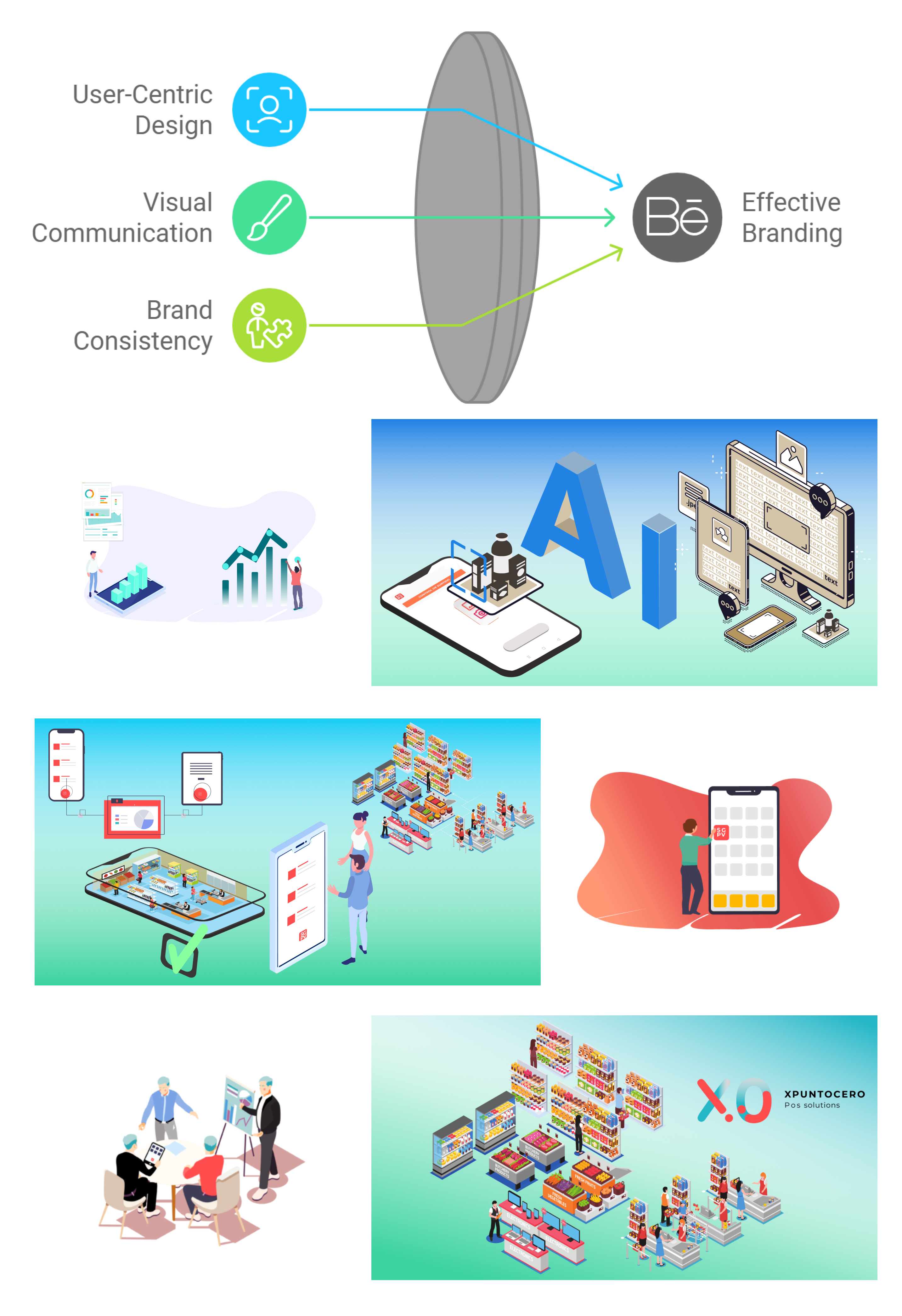
In my work, I approach rebranding as more than just a visual update—it’s about aligning the brand’s identity with its core values and the experience it aims to deliver. Whether through logo design, icons, advertisements, or graphic imagery, my goal is to create visuals that are not only aesthetically pleasing but also deeply connected to the brand’s narrative and insights gained through UX research.
Design Rooted in Research
Each visual decision I make is driven by user research. I take the time to understand the target audience, their behaviors, and their preferences. By grounding my design choices in these insights, I ensure that every element—whether a logo or an advertisement—resonates with users and communicates the brand’s message effectively.
Communicating Through Visuals
Visuals are powerful tools for communication. I believe that users should be able to grasp the essence of a message before even reading the text. This principle guides my design philosophy. For example, through the careful use of color, typography, and imagery, I aim to tell a story that complements the written content, allowing users to quickly and intuitively understand the message.
Brand Identity Consistency
A strong visual identity is key to brand recognition. My approach to rebranding ensures consistency across all touchpoints—logos, icons, web imagery, and even offline advertisements. This unified visual language not only strengthens brand recognition but also builds trust with the audience. When users encounter familiar visuals across different mediums, it reinforces the brand’s presence in their minds.
Key Elements of My Visual Work
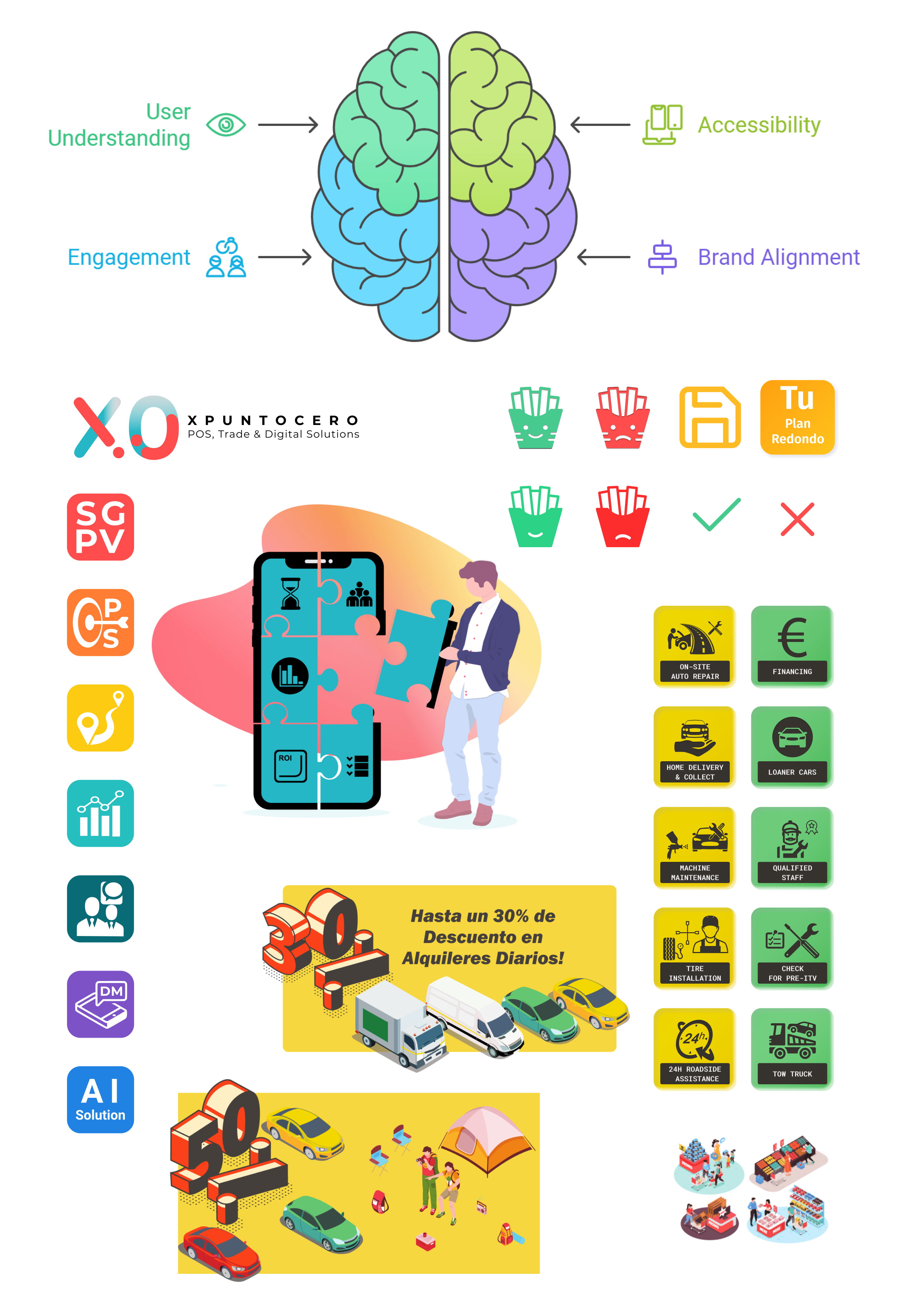
- Logo Design: I create logos that are simple, memorable, and reflective of the brand’s essence. Each design choice, from color to shape, is intentional and serves to communicate the core identity of the company.
- Icons and Imagery: icons are more than just decorative elements; they serve as functional visual aids that guide users through the digital experience. By designing clear, intuitive icons, I ensure users can navigate content easily.
- Advertisements and Graphic Design: I design promotional materials that capture attention and convey the intended message quickly and effectively, ensuring that the brand’s voice is loud and clear.
- Team Efficiency: improved coordination and use of project management tools led to a 20% increase in team productivity, reducing the time spent on repetitive tasks and improving workflow efficiency.
Visuals as a Standalone Communication Tool
Whenever possible, I strive to let the visuals do the heavy lifting. I design in a way that allows users to understand the core content without relying heavily on text. This approach not only enhances accessibility but also makes the experience more engaging, especially for users who prefer visual cues over written ones. Through this blend of UX insights and visual storytelling, I ensure that the brand’s message is communicated in a way that is both impactful and aligned with the company’s identity.

